History Revealed
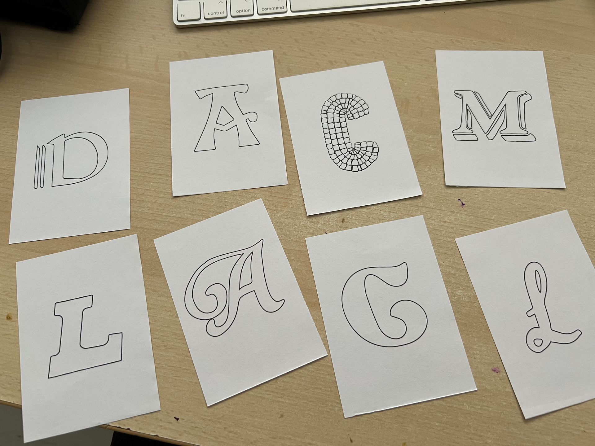
An exploration and collection of typographic examples used in and around the town of Emsworth. I researched and collected a broad range of examples taken from historical and contemporary reference points. The collection was then edited down to five examples I think best reflect the identity of the local area.
Historical Typography
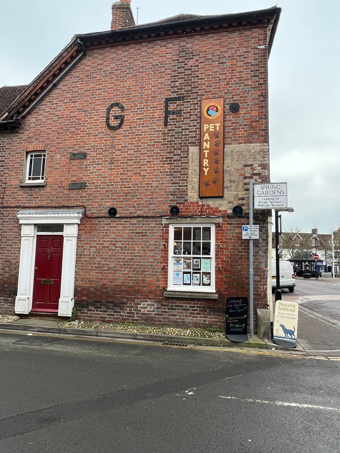
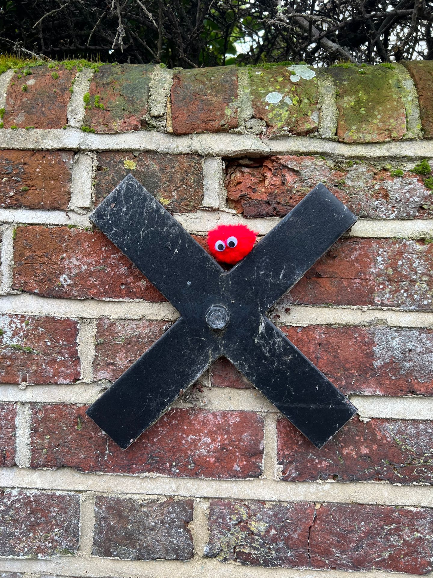
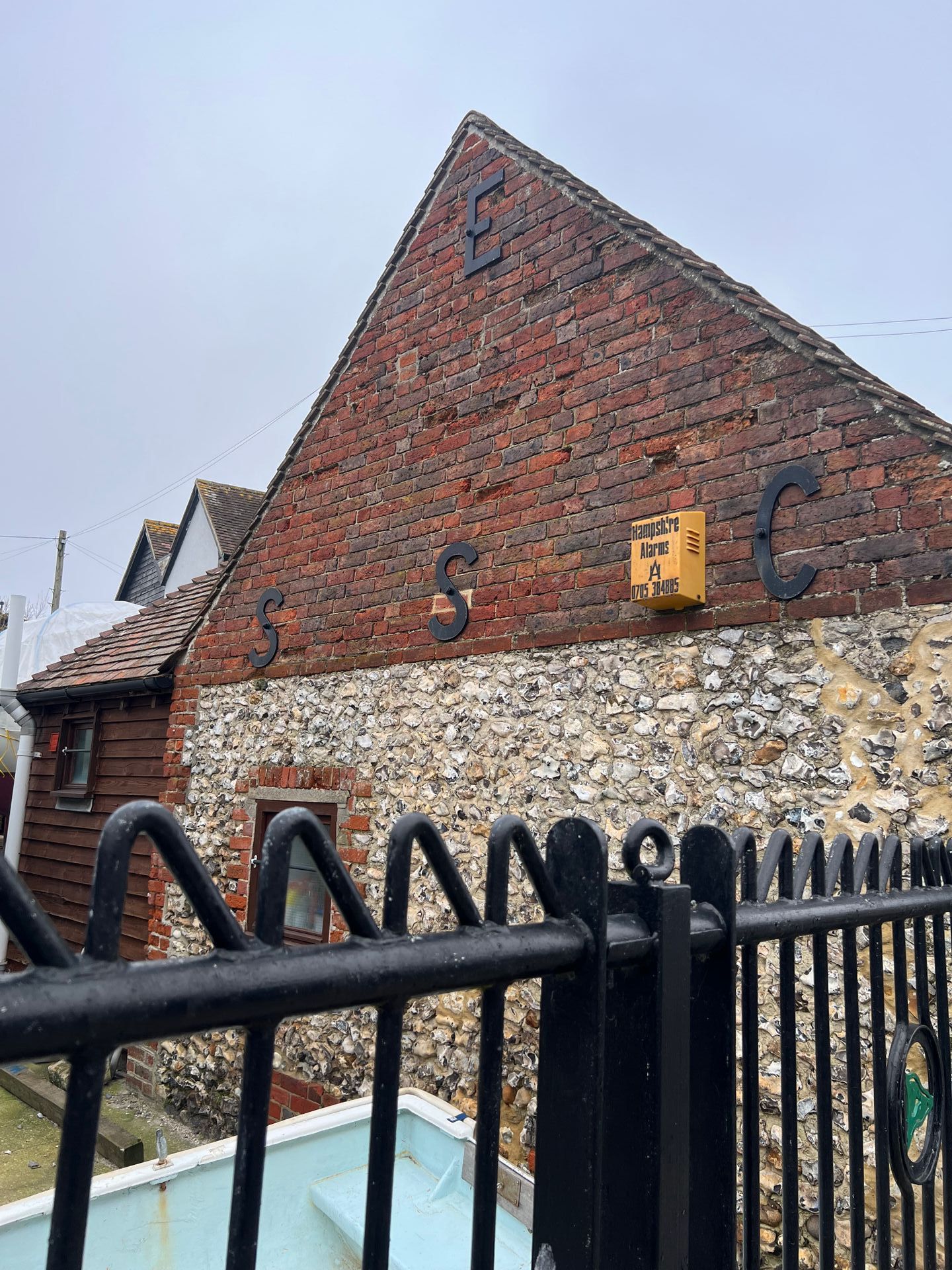
Anchor Plates
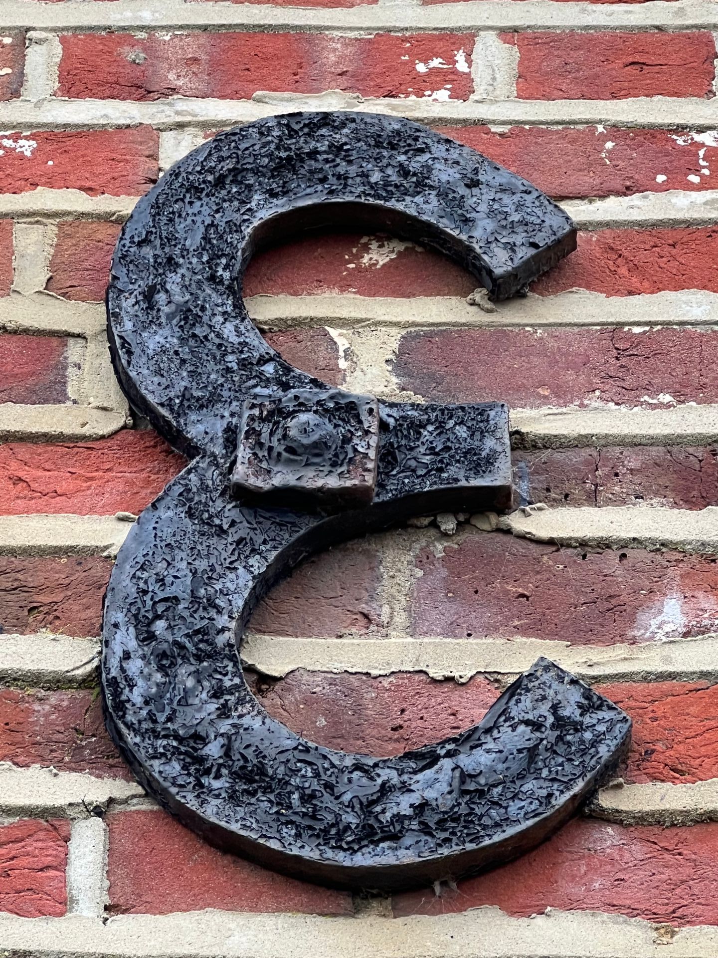
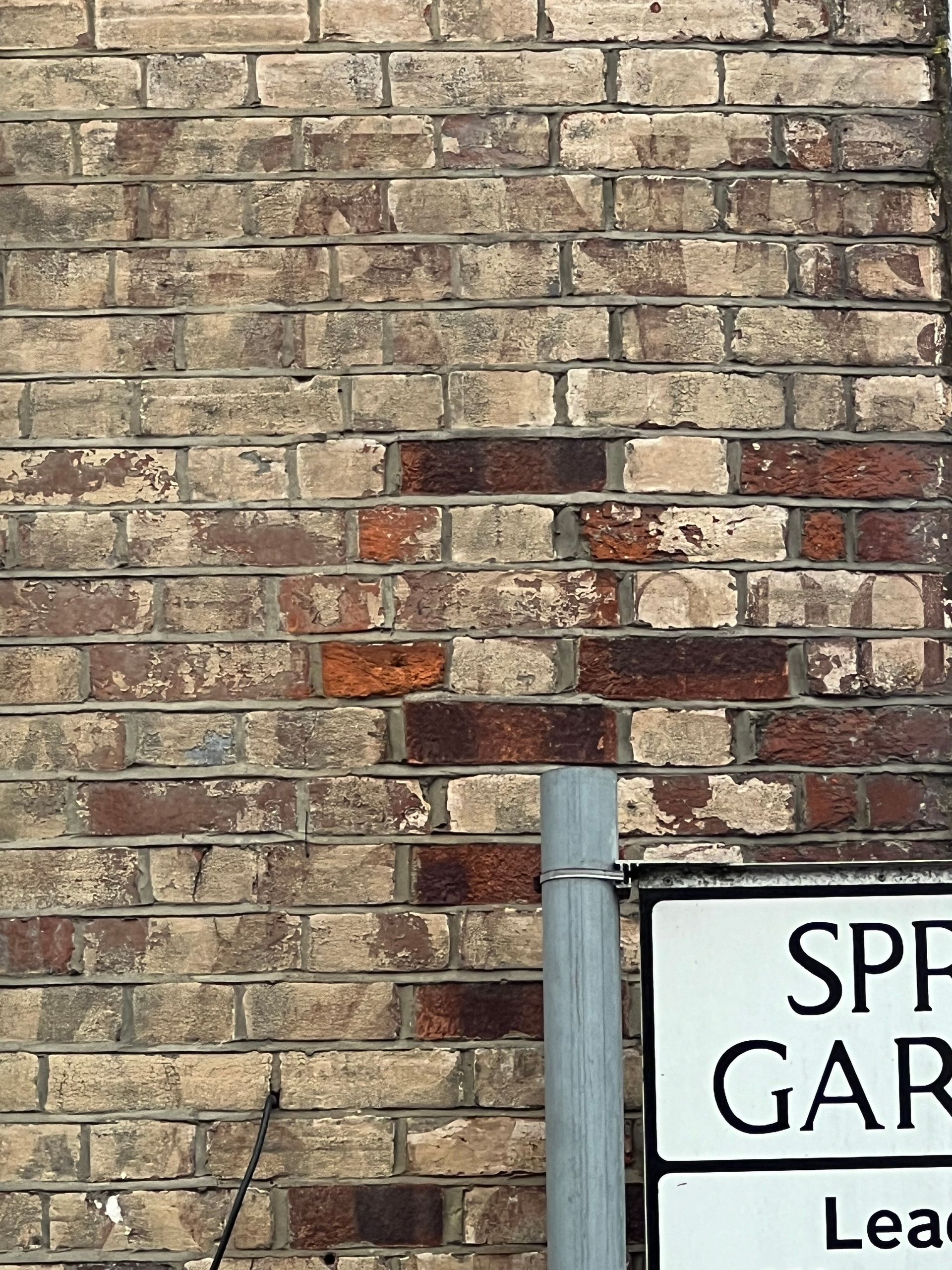
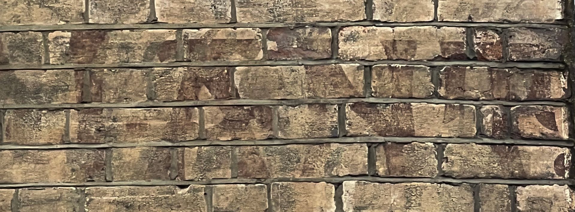
An anchor plate is a large plate or washer connected to a tie rod. Anchor plates are used on exterior walls of masonry buildings for structural reinforcement. Due to their visibility, many anchor plates have a decorative style. Common styles are the X-wall tie plate, S-iron, and T-head. In the United Kingdom, pattress plate is the term for circular restraints and tie bar being an alternate term for rectangular restraints.
‘Anchor plates are made of cast iron, sometimes wrought iron or steel, and are often used on brick or other masonry-based buildings. They are commonly found in many older cities, towns and villages in Europe and in more recent cities with substantial legacies of 18th- and 19th-century brick construction’ (Wikipedia, 2022). So, these anchor plates give away the historical nature of many of the buildings in the village.
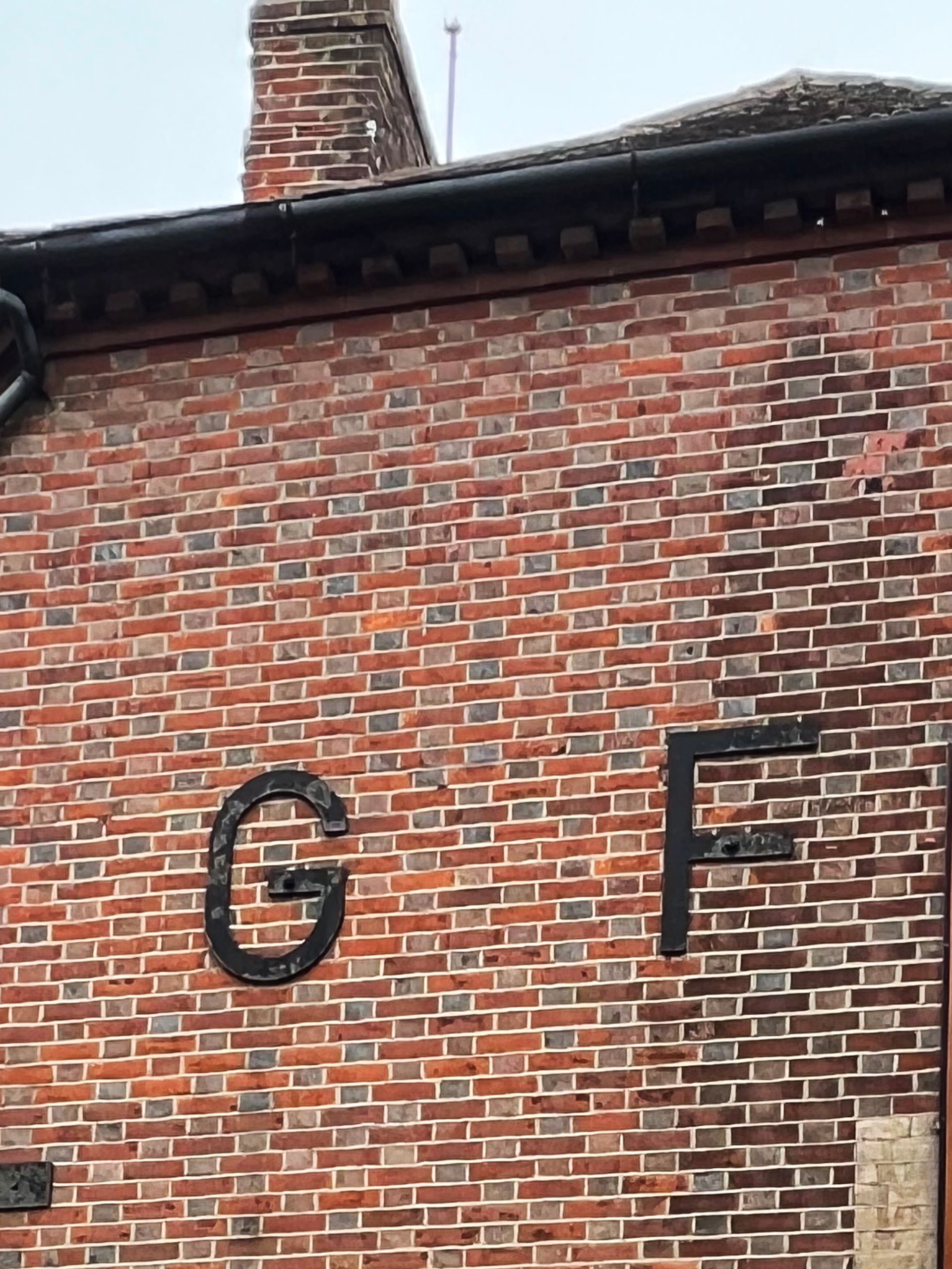
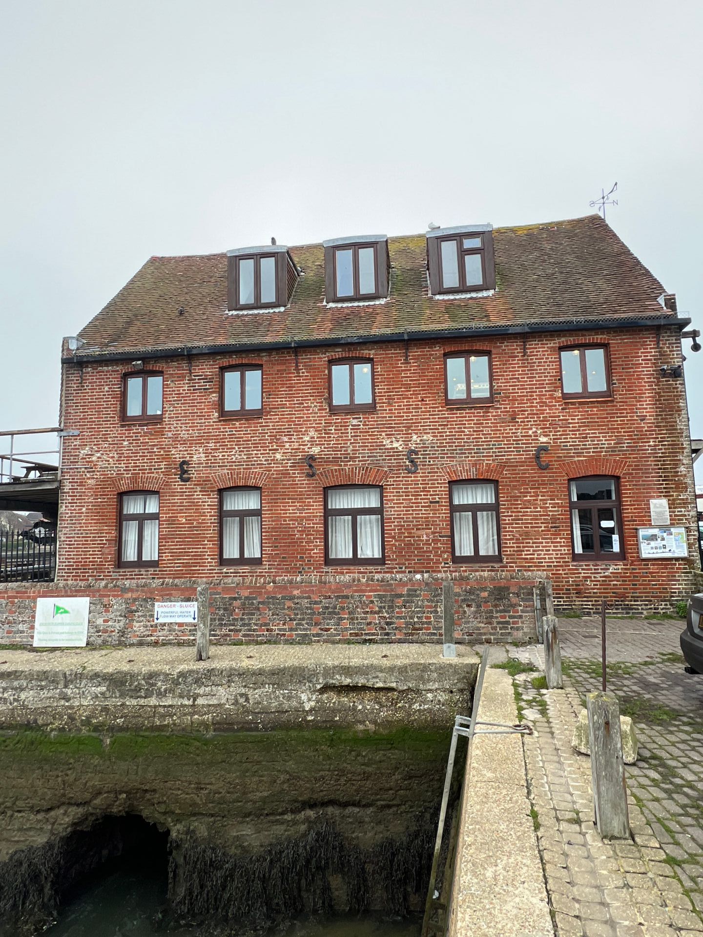
Although, there are many types of anchors or anchorages, according to the Dictionary of Architecture and Construction, an anchor plate specifically is a ‘wrought-iron clamp, of Flemish origin, on the exterior side of a brick building wall that is connected to the opposite wall by a steel tie-rod to prevent the two walls from spreading apart; these clamps were often in the shape of numerals indicating the year of construction, or letters representing the owner’s initials, or were simply fanciful designs’ (Hisour, nd). The first two images below demonstrate how the business prior to the Pet Pantry, called Grate Fyres, used initial anchors G and F to act as additional proud identifiers as the proprietors of the building. These would have been alongside their business sign, which would have covered the earlier ghost sign now exposed under the Pet Pantry sign and signage on the shop front around the corner.
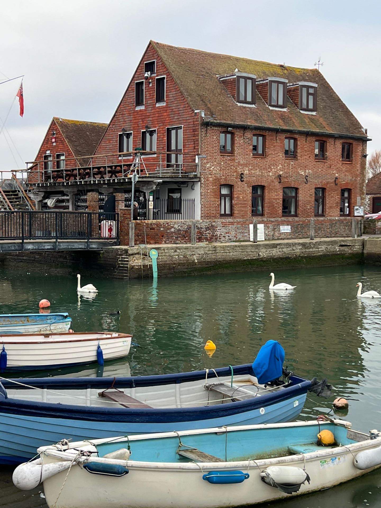
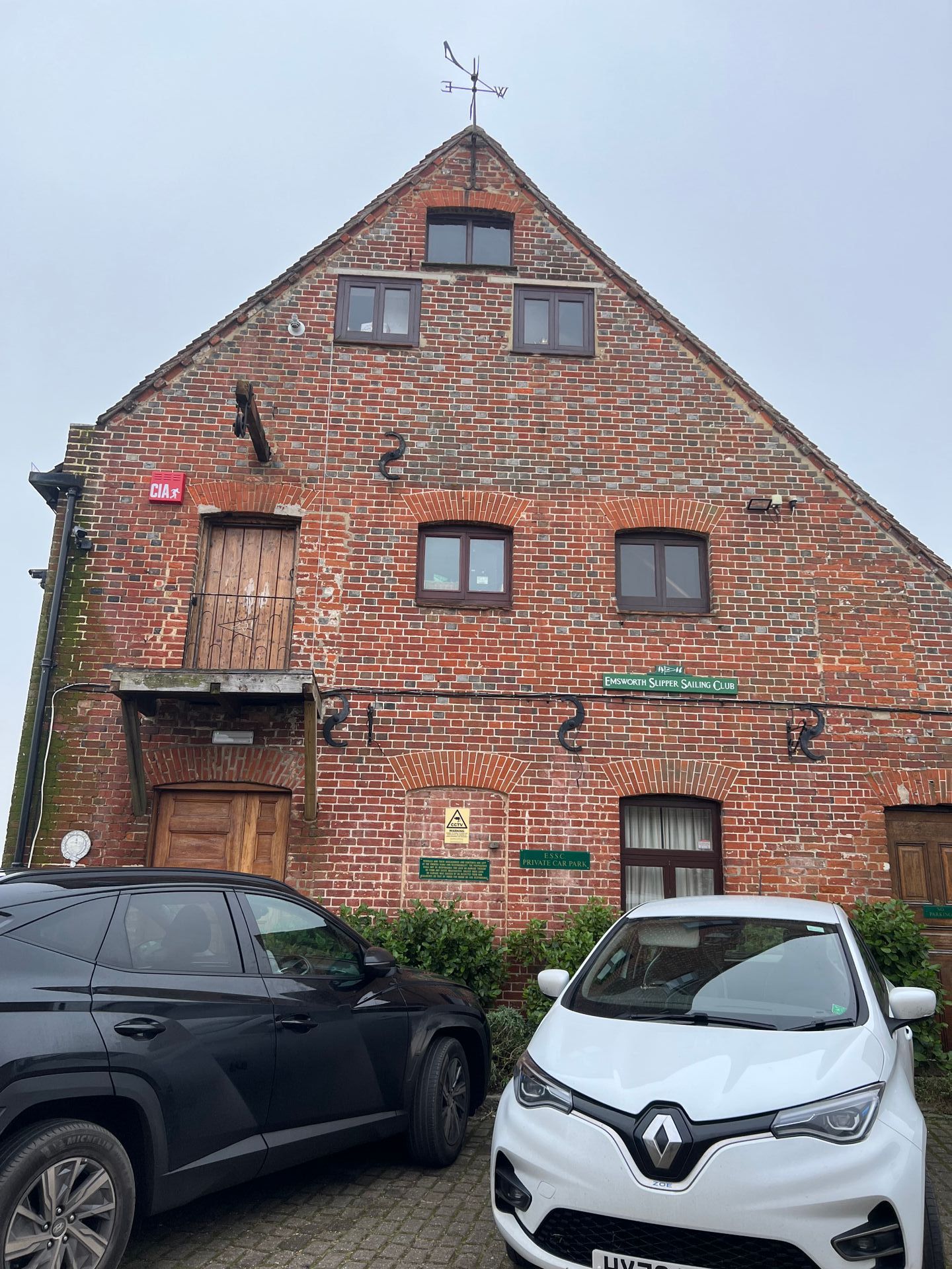
Hard to believe that the Emsworth Slipper Sailing Club (above) at one time was left derelict when it was in such a prominent position and despite its history as a once working mill. Thankfully it was rescued and renovated to what we see today.
Photos: Ellie Cross
Ghost Signs
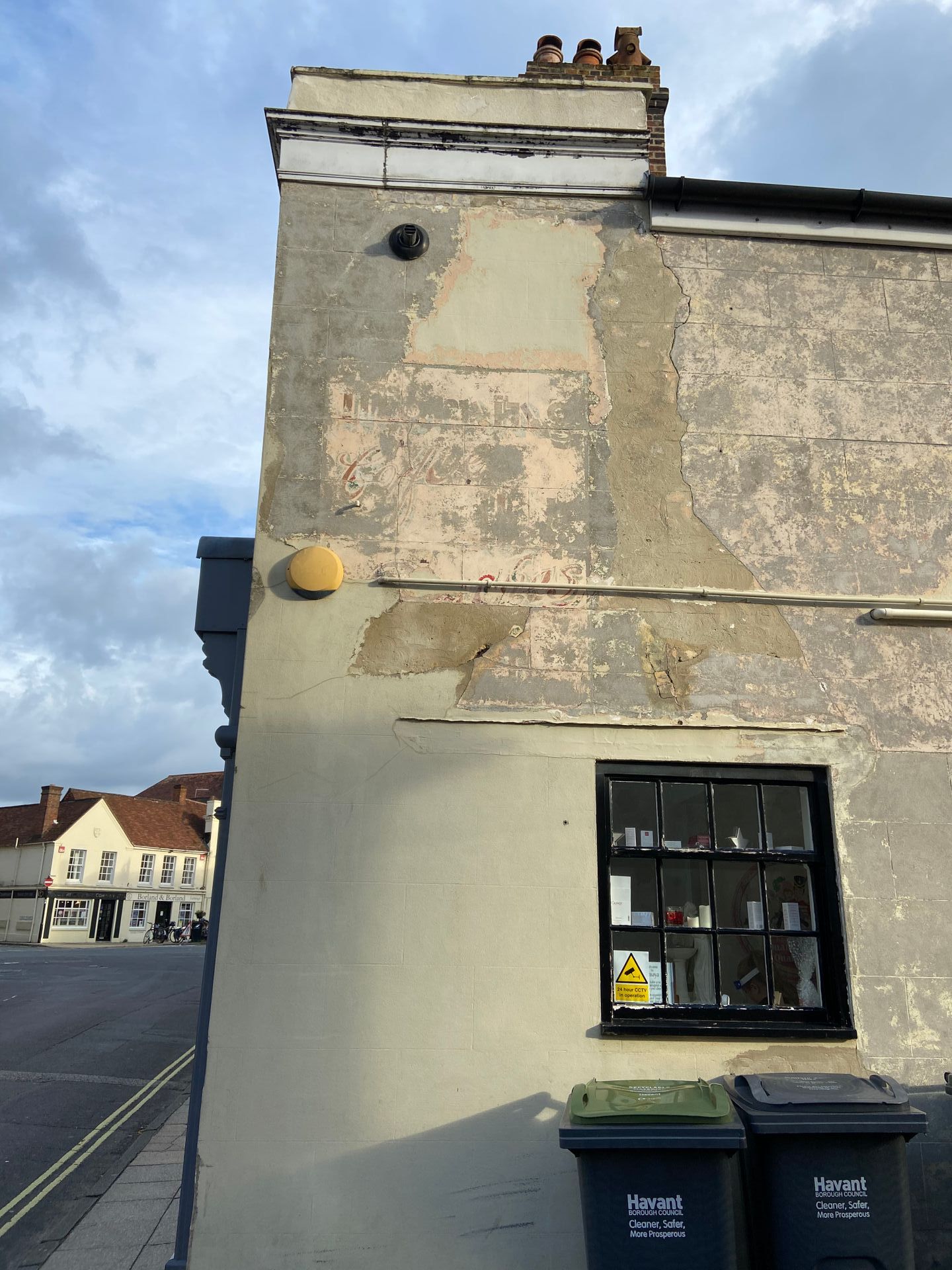
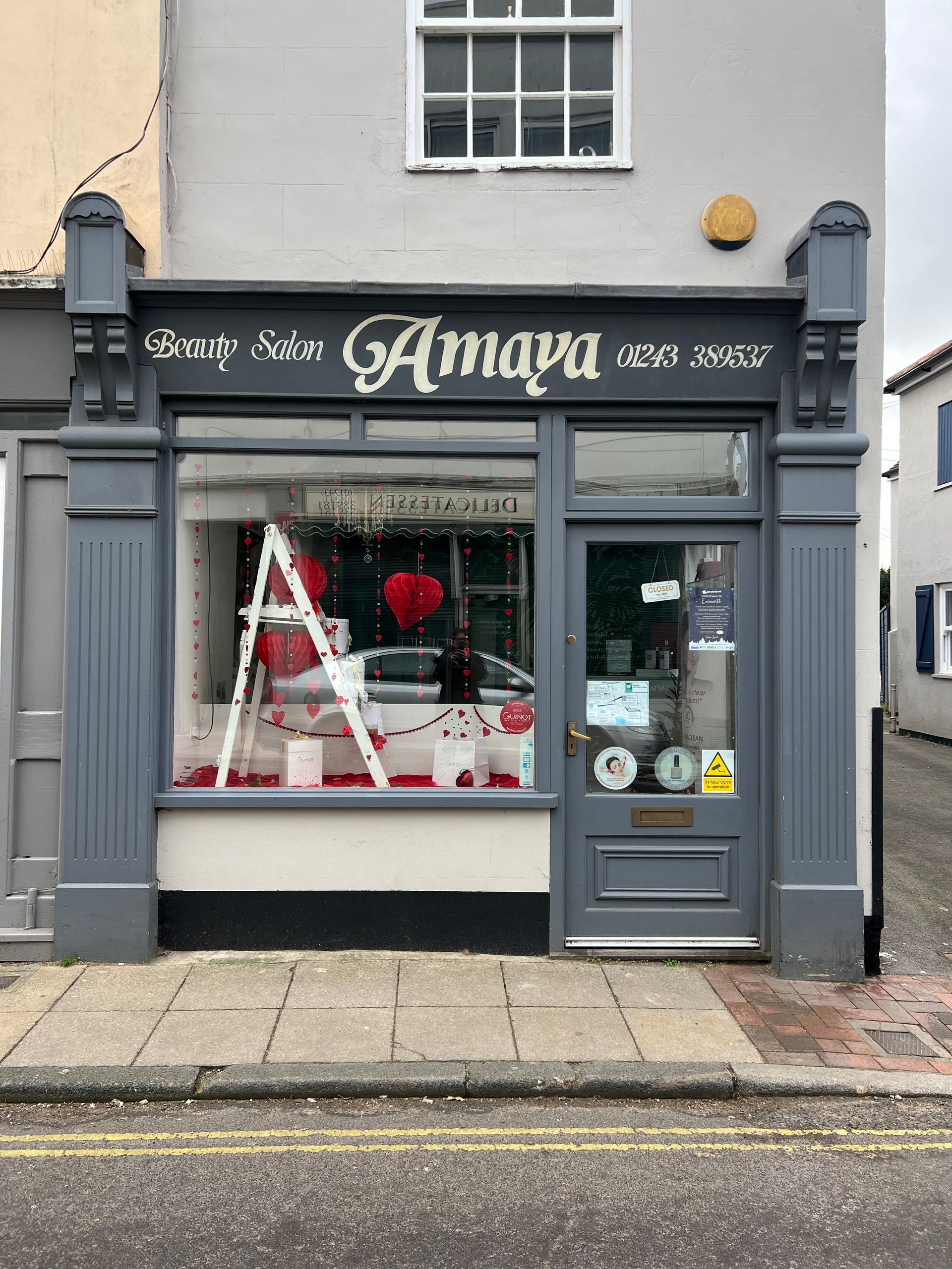
Recently exposed ghost sign while some external building work was in progress. Currently, a beauty salon, it would appear it was once a coffee shop, around the 1950's according to discussions on a facebook page 'Memories of old Emsworth' where I posted the photographs to see if I could discover more. The word 'coffee' can be seen in a script style of lettering. Sadly, due to the wall repairs the lower lettering is difficult to decipher. The current beauty salon has chosen to have a signwritten shop front, sympathetic to a tradition gone before (see Beauty Salon Amaya below under signwriting).
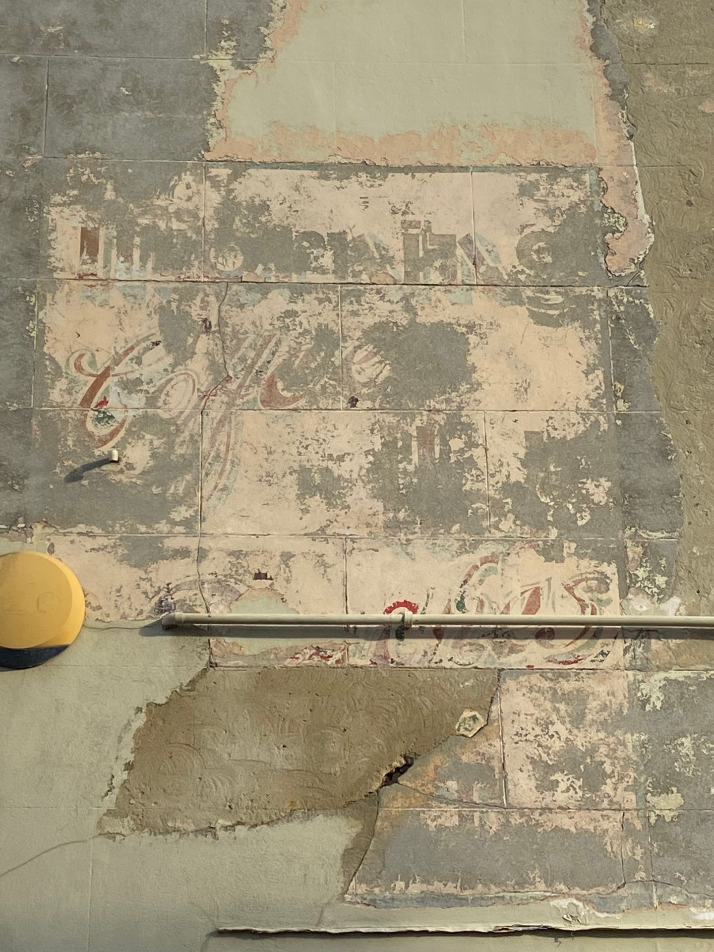
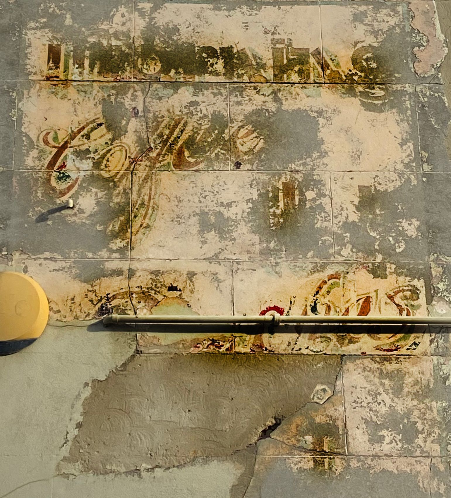
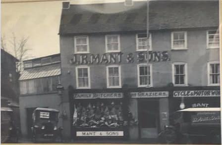
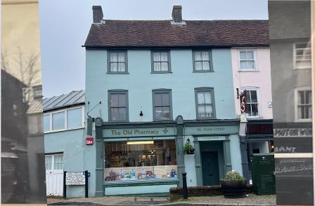
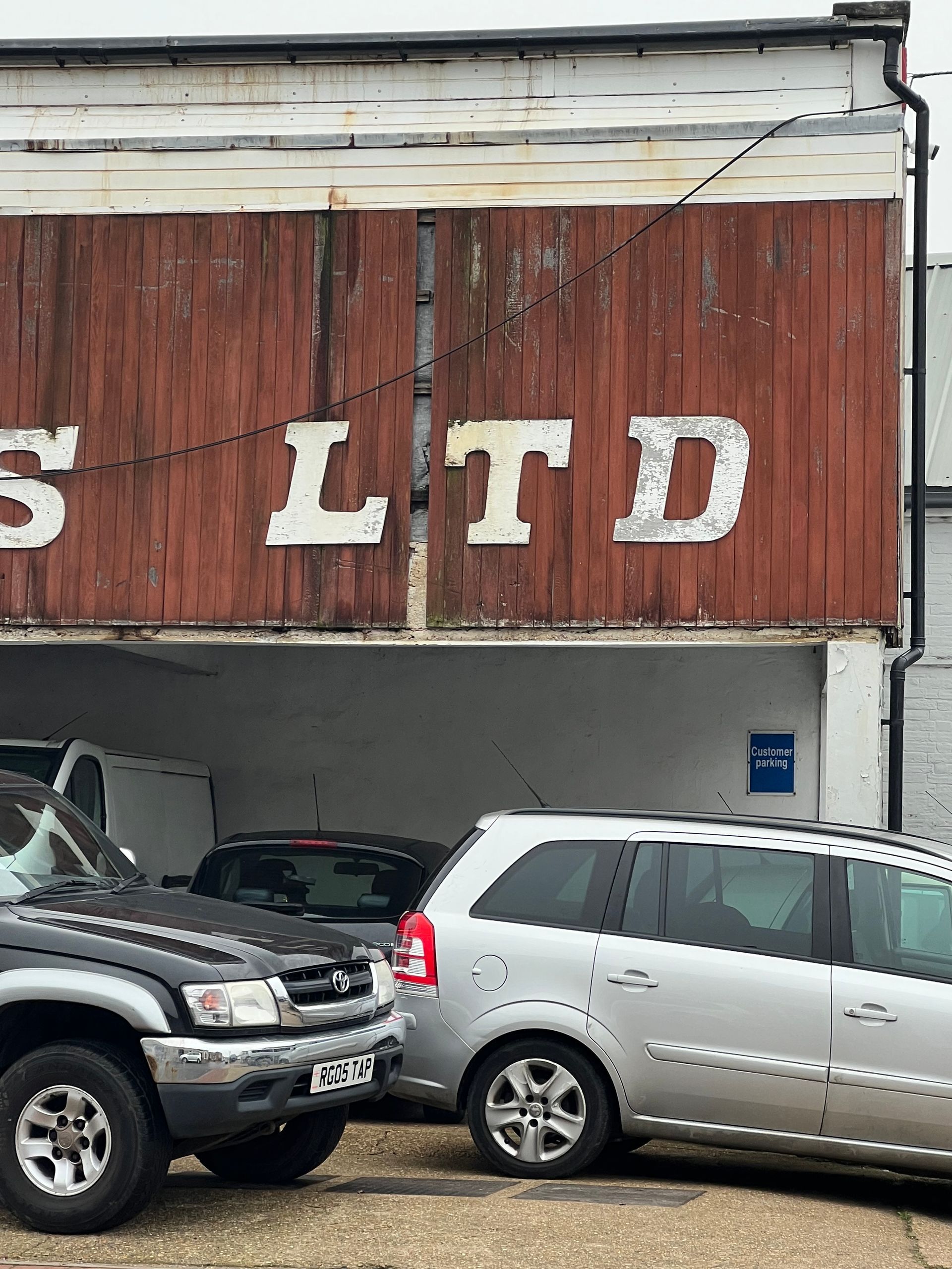
Many painted signs have been lost through painting over the entire exterior walls, as seen below in this example of what was once Mant's butchers and now the Old Pharmacy (although it has been home to several others in between). The ghost sign in the above right image underneath the, Pet Pantry sign, is believed to have also been a Mant's butchers sign run by the same family as below. It is difficult to decipher all the letters, as it appears on closer inspection that there are multiple letters overlaid otherwise knowns as a palimpsest. The Letters appear more ornate with the style of serifs, so more than likely date a lot earlier than the coffee sign c1950-60.
Photos above: Ellie Cross. Below: Mant & Sons, Memories of Emsworth | Old Pharmacy, Ellie Cross.
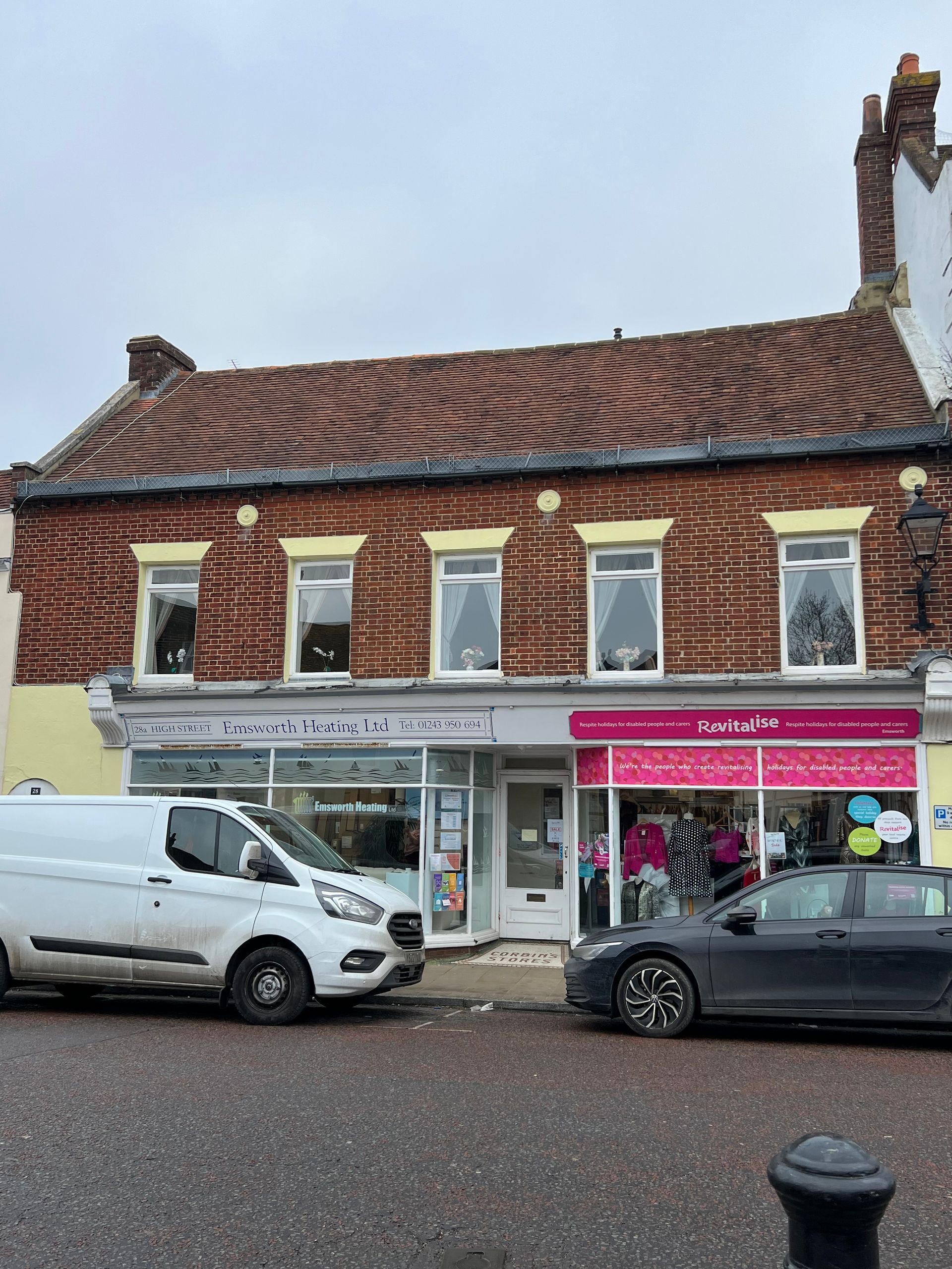
Mosaic Entrances
Mosaics date way back in history but only came to the west in the 19th century in the form of tiled mosaic entrances. They were the height of fashion in the Victorian era and many shops and apartment buildings had one. These entrances would have brought an air of sophistication and confidence to those entering a shop. These mosaic artworks are a piece of social history, that would have required skill and patience. During the Victorian era, contemporary mosaic tiles were installed throughout entranceways, hallways and kitchens, with the black and white square tiles often highlighted by beautifully coloured mosaic tile accents and designs. The contemporary geometric finish of this popular tiling style has stood the test of time, with many homeowners now restoring these beautiful finishes to their former glory.
The building today has been split into to separate shop units and the modern signage almost lost compared to the grandeur and pride of the 19th century signage and ornate entrances.
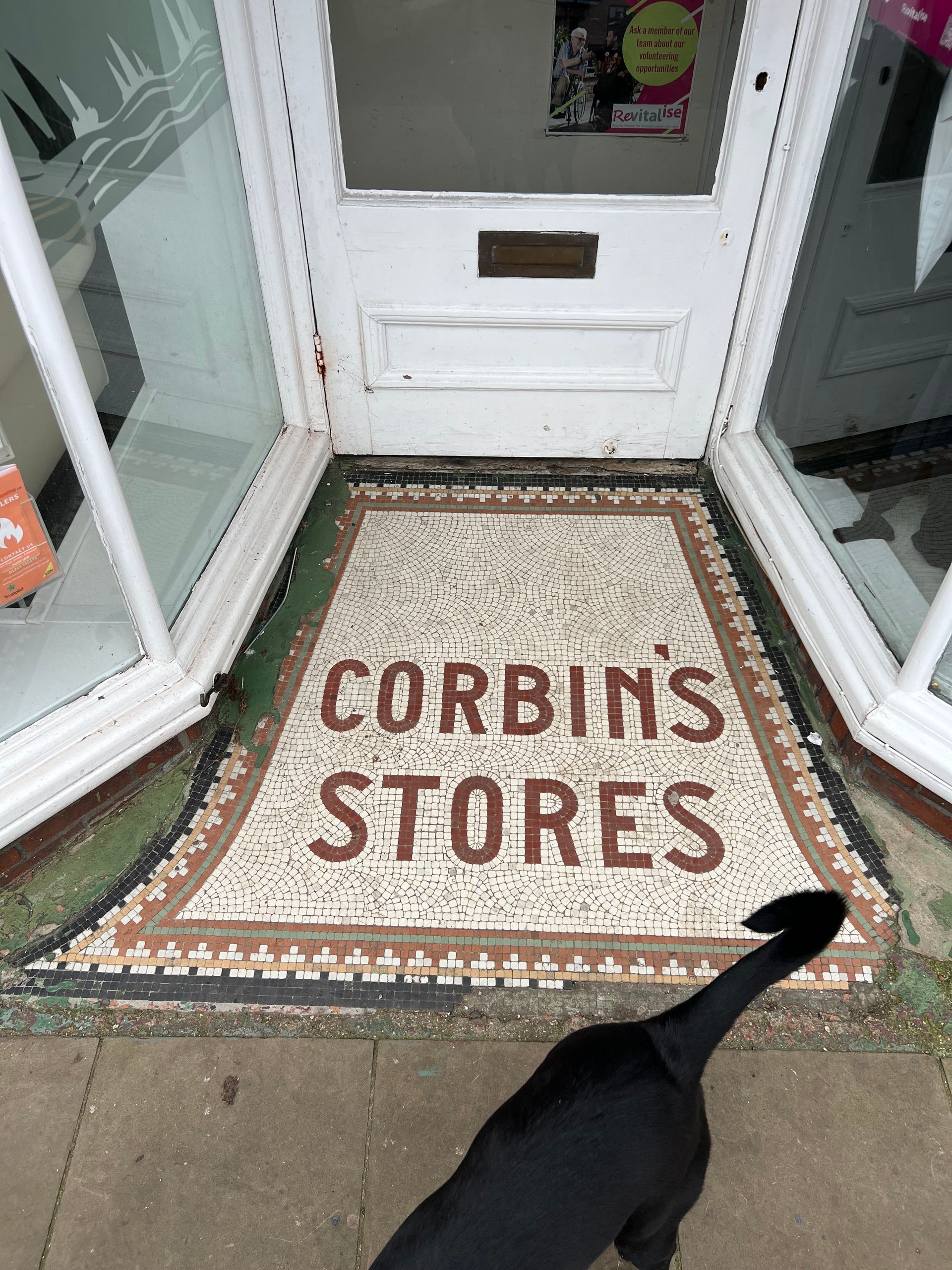
Photos: Ellie Cross | B&W images: Memories of Old Emsworth (2020)
Traditional Signwriting
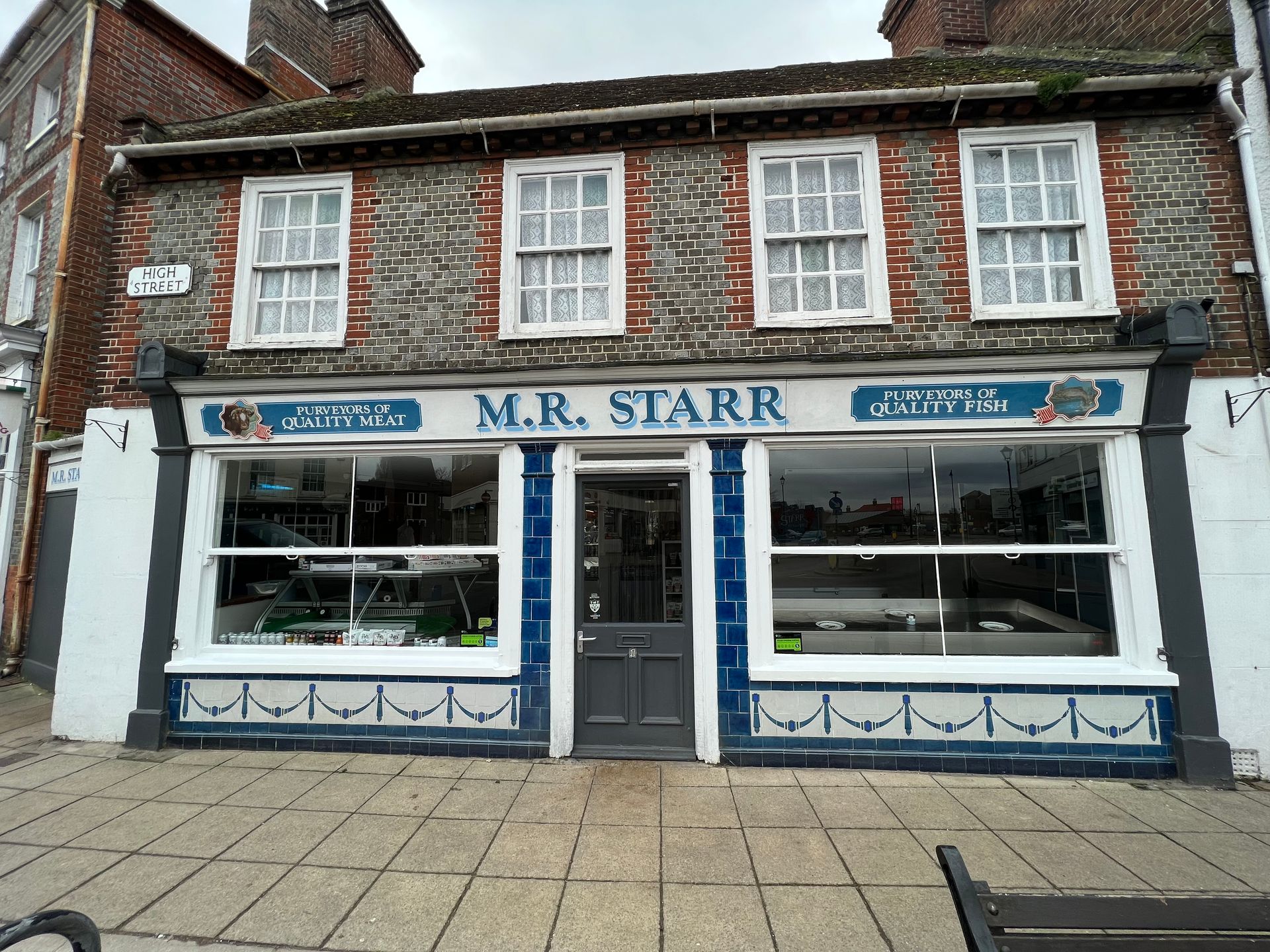
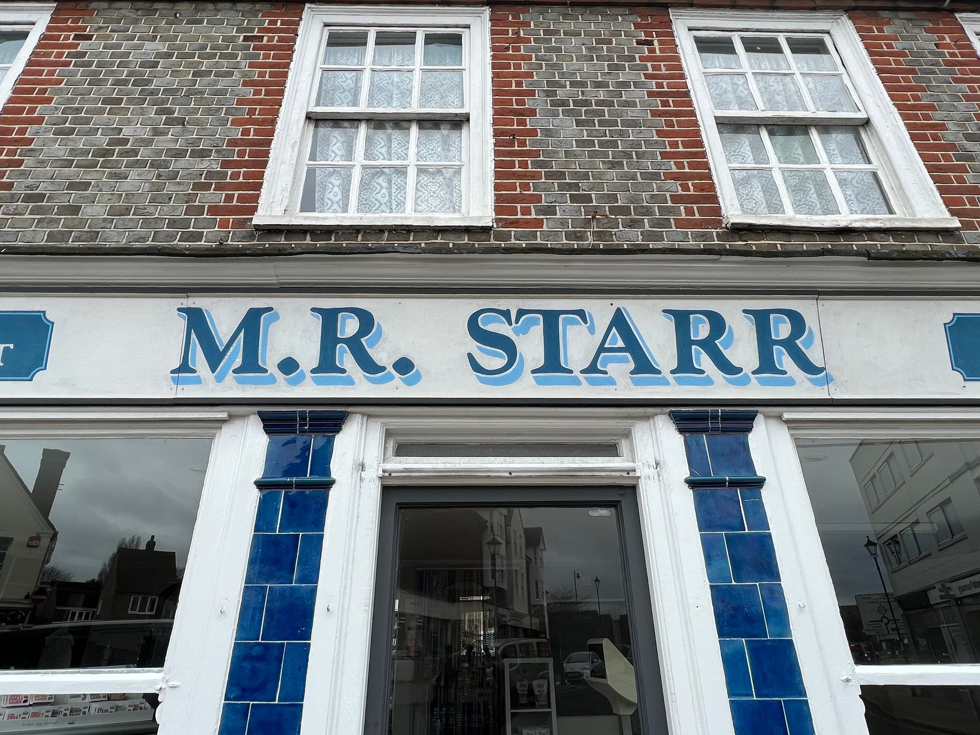
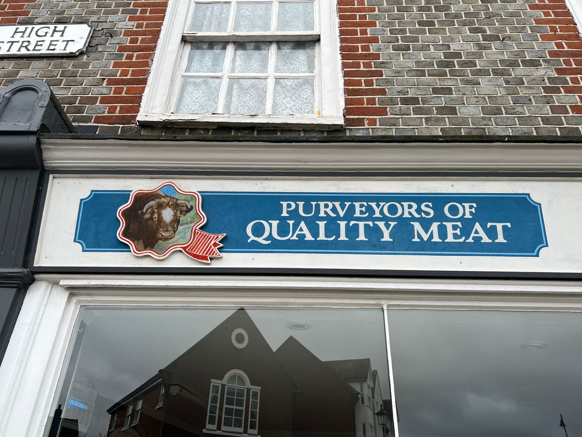
I love the use of 'purveyors of quality meat/fish' instead of butchers, it sounds so superior to the competition. The purveyors name, M.R. Starr stands proud with a clear visibility, just like Corbin's did above.
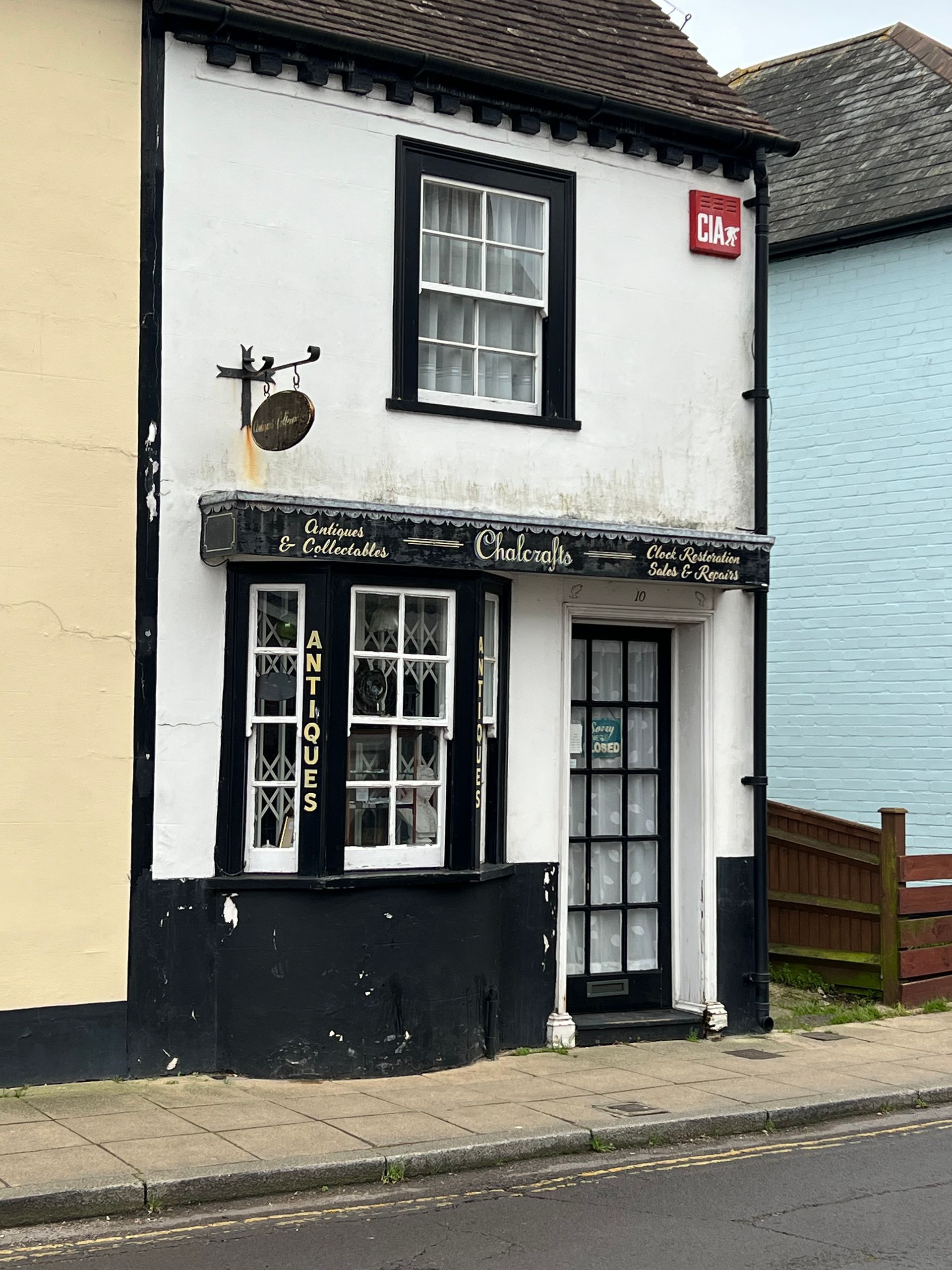
Chalcrafts Antiques feels like a step back in time and reminiscent of a bygone Emsworth, with lettering adorning the angled, vertical sections of the bay window to stand out to passers-by, as they walk from either direction along the pavement. A hanging wall sign attempts to do the same, but the lettering is so small it does not have any impact from a distance and would be easily overlooked. Due to the limited space of the shopfront a script style lettering does not have clarity and is therefore difficult to read, unless you are close to it. The name needs to be bolder to create a clear hierarchy from the business credentials.
The curvy script used for Amaya brings a feminine softness to the name and the script style used for, Beauty Salon, exudes elegance and luxury. The space here allows for this style of lettering and can easily be read with a clear hierarchy. The italics of, beauty salon and the phone number make legibility a little more difficult from a distance, yet clear from a closer proximity.
In all examples, you can see the brush strokes and the workmanship that has gone into the work. At one time there was probably several signpainters living in the area with their very own shop front.
One advantage of using a sign writer is they always carry their tools with them, so if you want an addition they can oblige there and then. No need for consultation unlike modern methods where the sign maker has a reliance on a computer and a machine to do the work, so inevitably would have to come back at a later date to install.
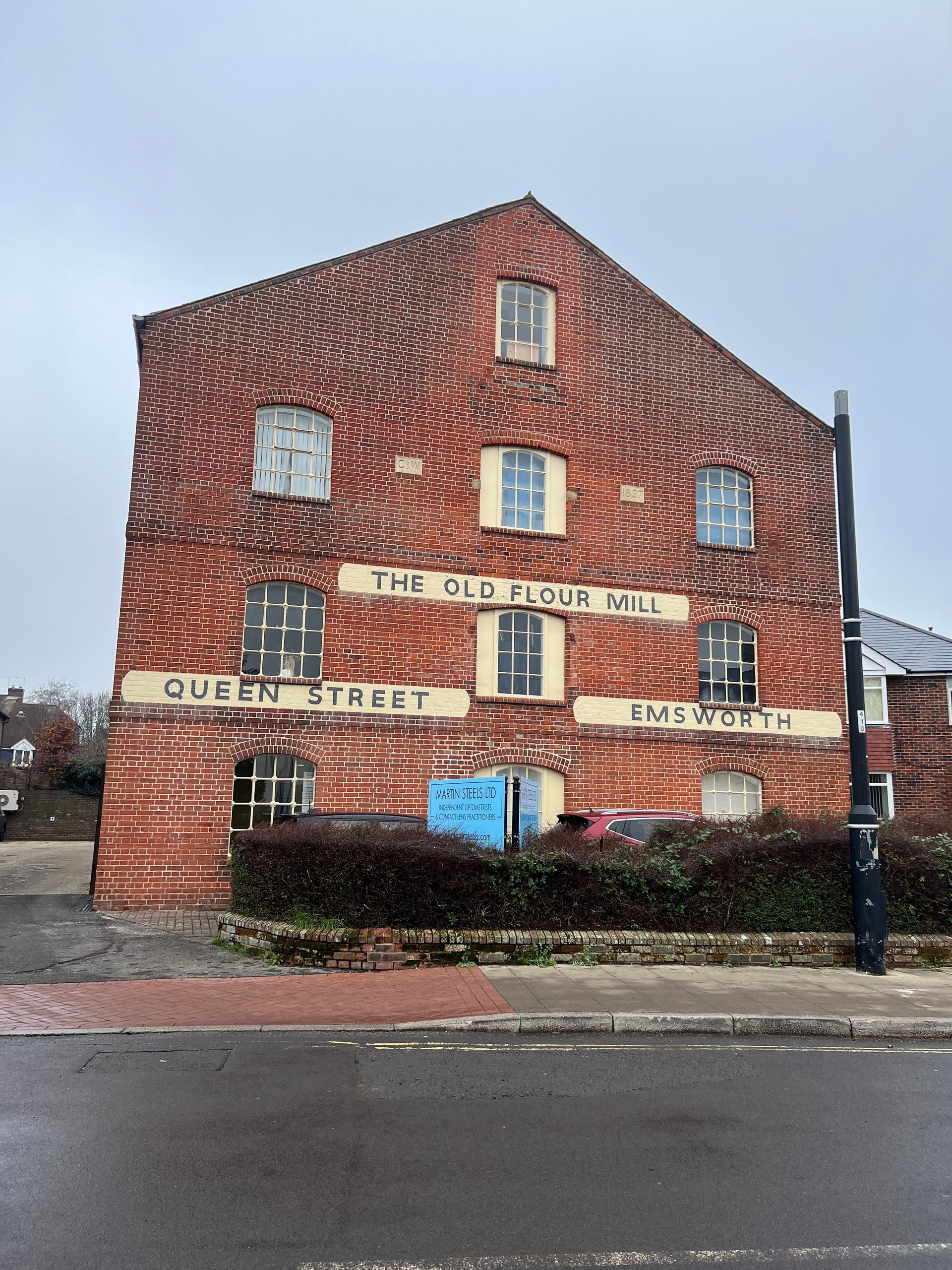
The Old Flour Mill below has some interesting letter spacing especially on the word, Emsworth where some of the letters are inconsistent with the character of the other letters and appear to have been arguing e.g. s and w, and the spacing for worth looks somewhat relaxed compared to the rest. Working with scale exaggerates spacing mistakes.
Photos: Ellie Cross
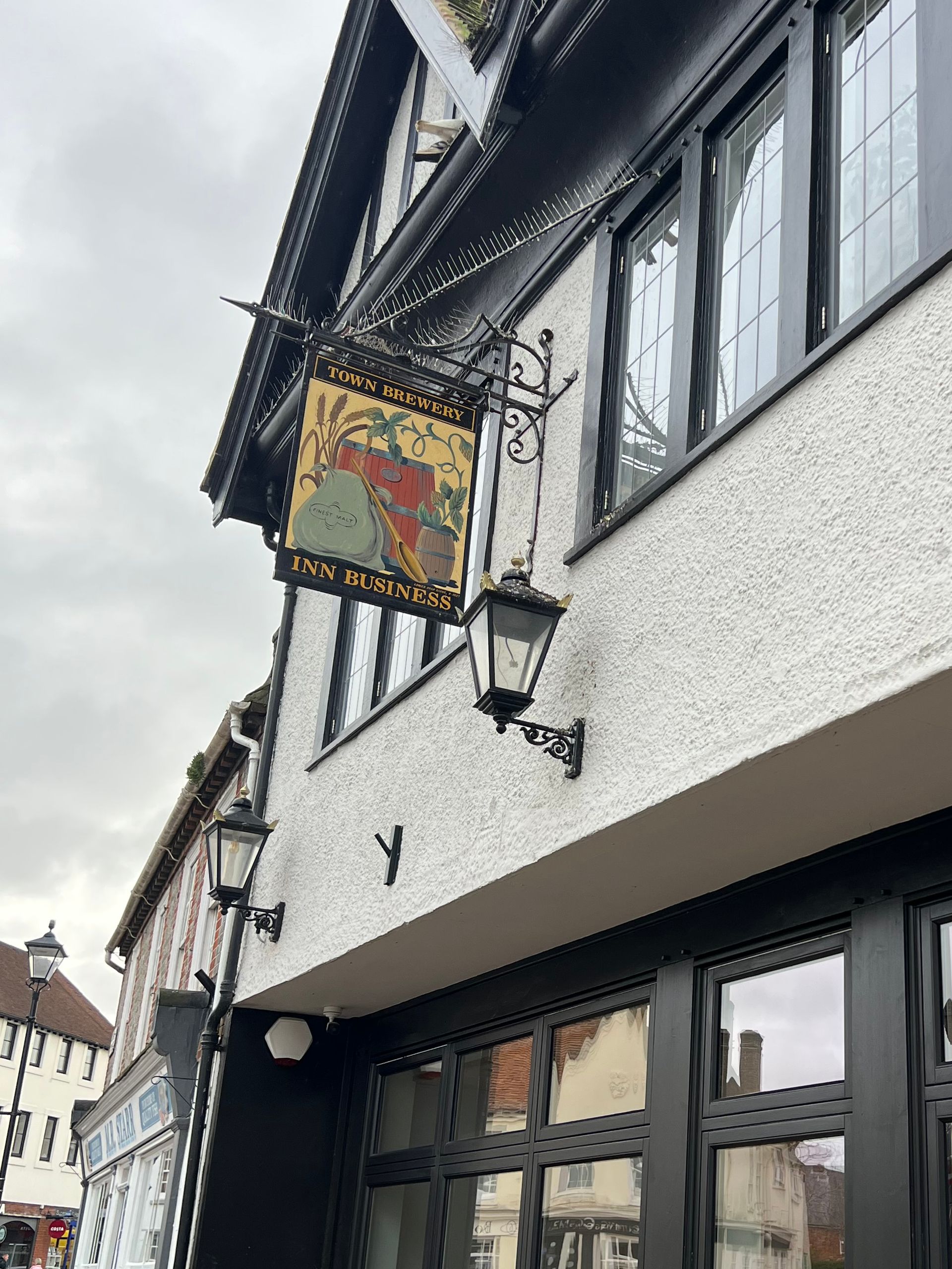
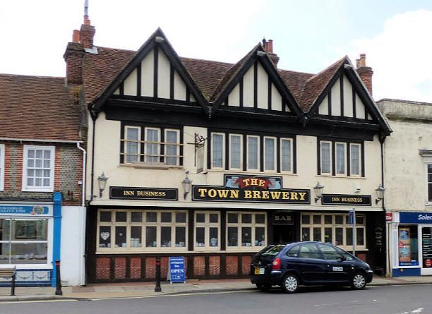
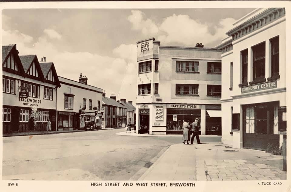
Pub Signs
Like many towns and villages, Emsworth was once home to 11 public houses, but many have been lost over the years. Some buildings are still in situ with just a change in business and give a little nod to what was there before by leaving the original pub sign in place. Others signs have been saved from the skip by the local museum like the Railway Inn sign below, although I managed to snap it in situ before it went to its new home. The larger sign is still in situ and awaits its fate (too big for the museum), as the building is up for sale. Just incase you were wondering, the Railway is located right next to the train station. It was built in 1847 (Emsworth Online, nd) to coincide with the railway reaching Emsworth and the village getting its own station.
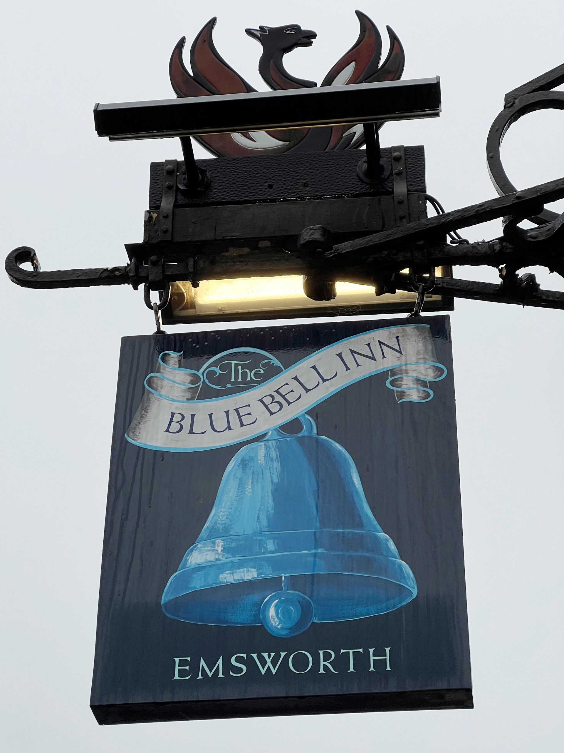
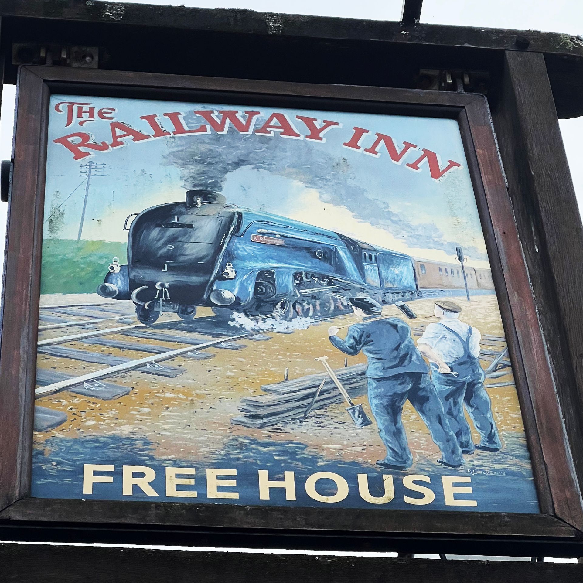
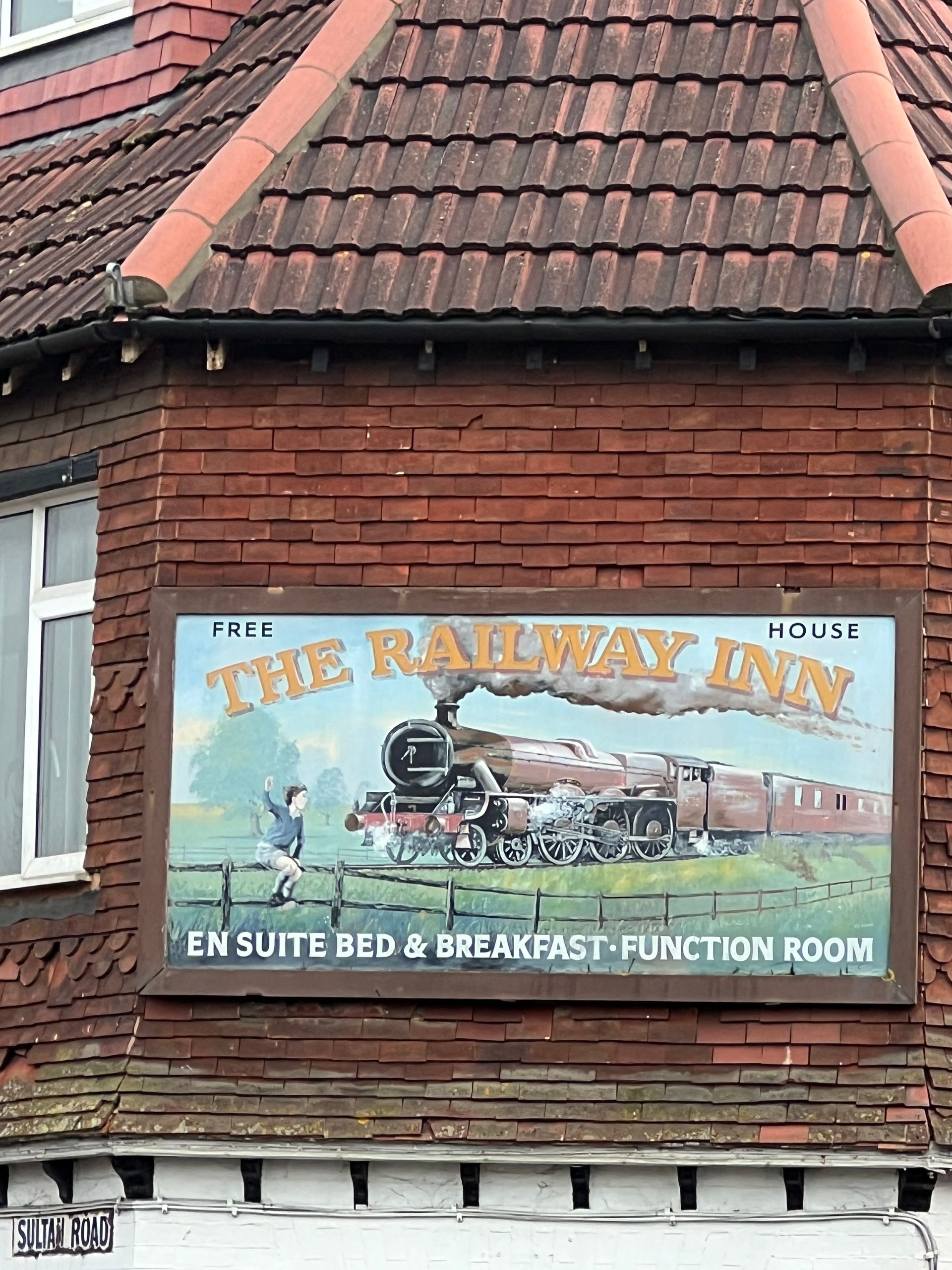
Photos: Ellie Cross
Street Signs
I knew that Jock Kinneir and Margaret Calvert, designed the Transport typeface that appears on all of the UK's road signage today, but didn't know about the arguement that ensued on its journey to fruition. I came across a great article on street and road signs, 'How serifs lost the road war but won the streets'.
I love the School Lane sign, below far right, where the two waring factions are brought together to sit in relative harmony.
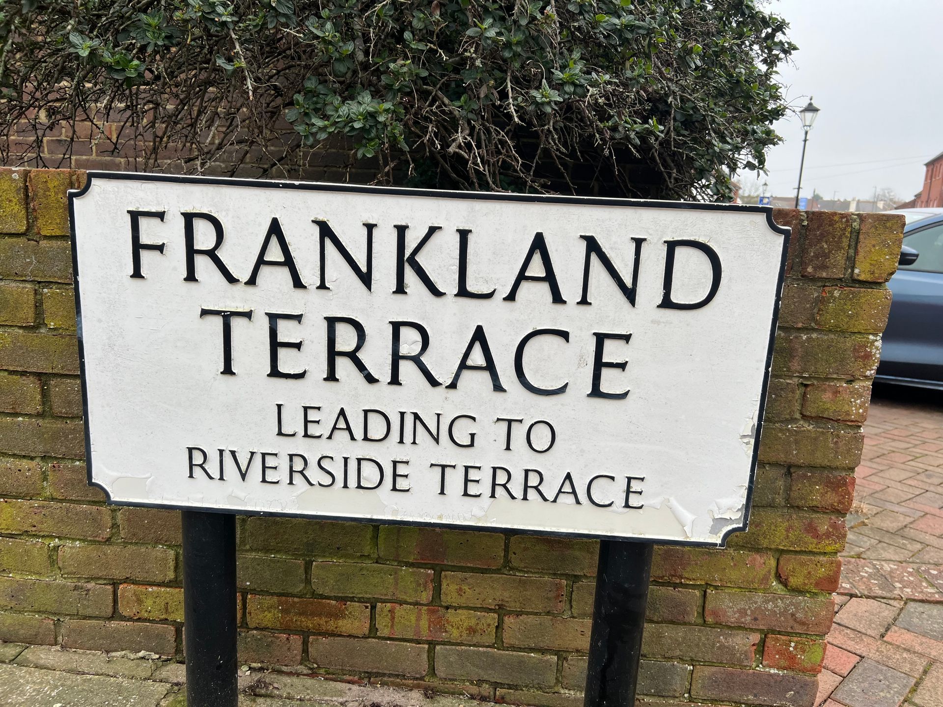

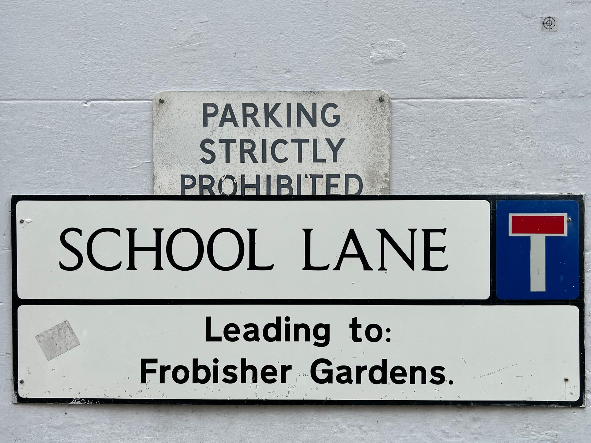

Photos: Ellie Cross
Art Deco to Slab Serif
Photos: Ellie Cross
Contemporary Typography
Vinyl Lettering
Low cost and quick to apply! Sadly, adhesive vinyl does not have the longevity of paint and I feel it is a reflection of modern, throwaway society, where things seem temporary and not made to last. A better use is for vehicle or window graphics, where they can also be removed easily.
I love the cracked effect on the museum lettering, it is like sparks of electricity coming from it or maybe lettering out of a horror movie.

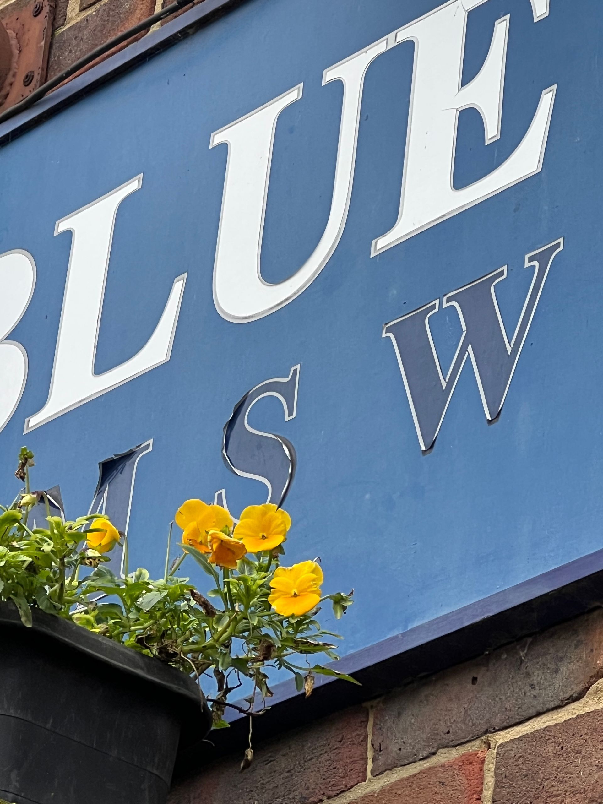
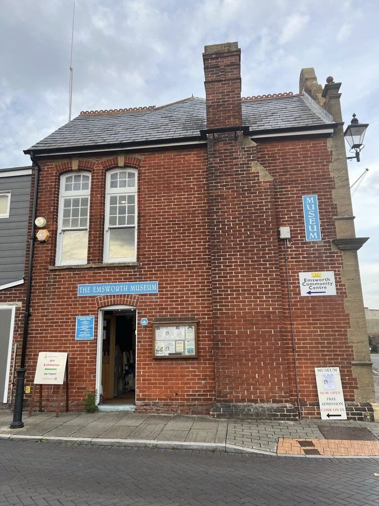
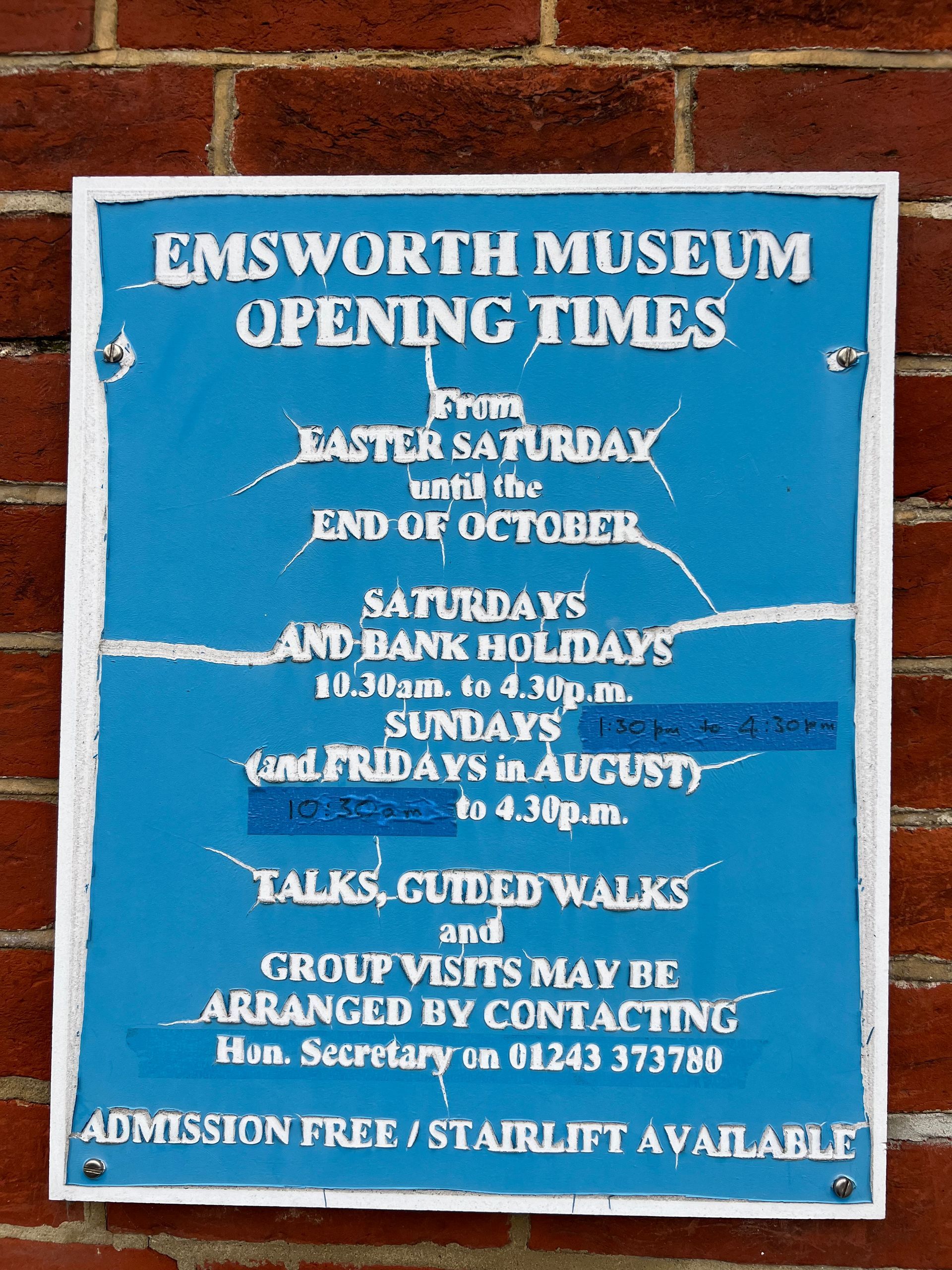
Photos: Ellie Cross
Serif vs San Serif
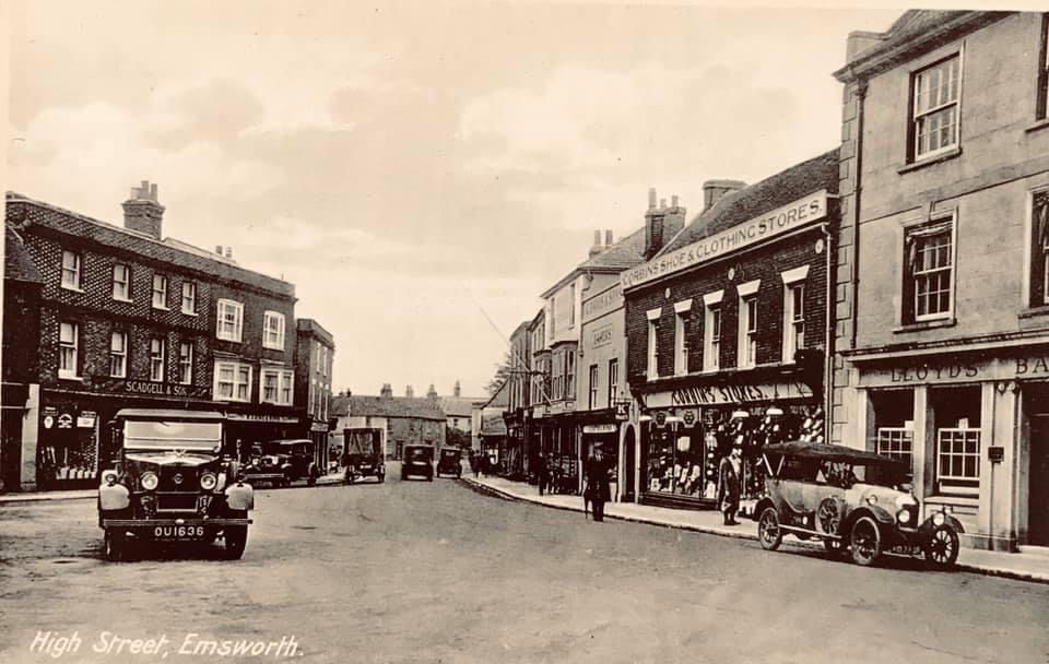
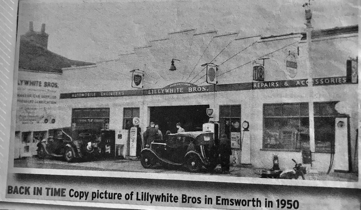
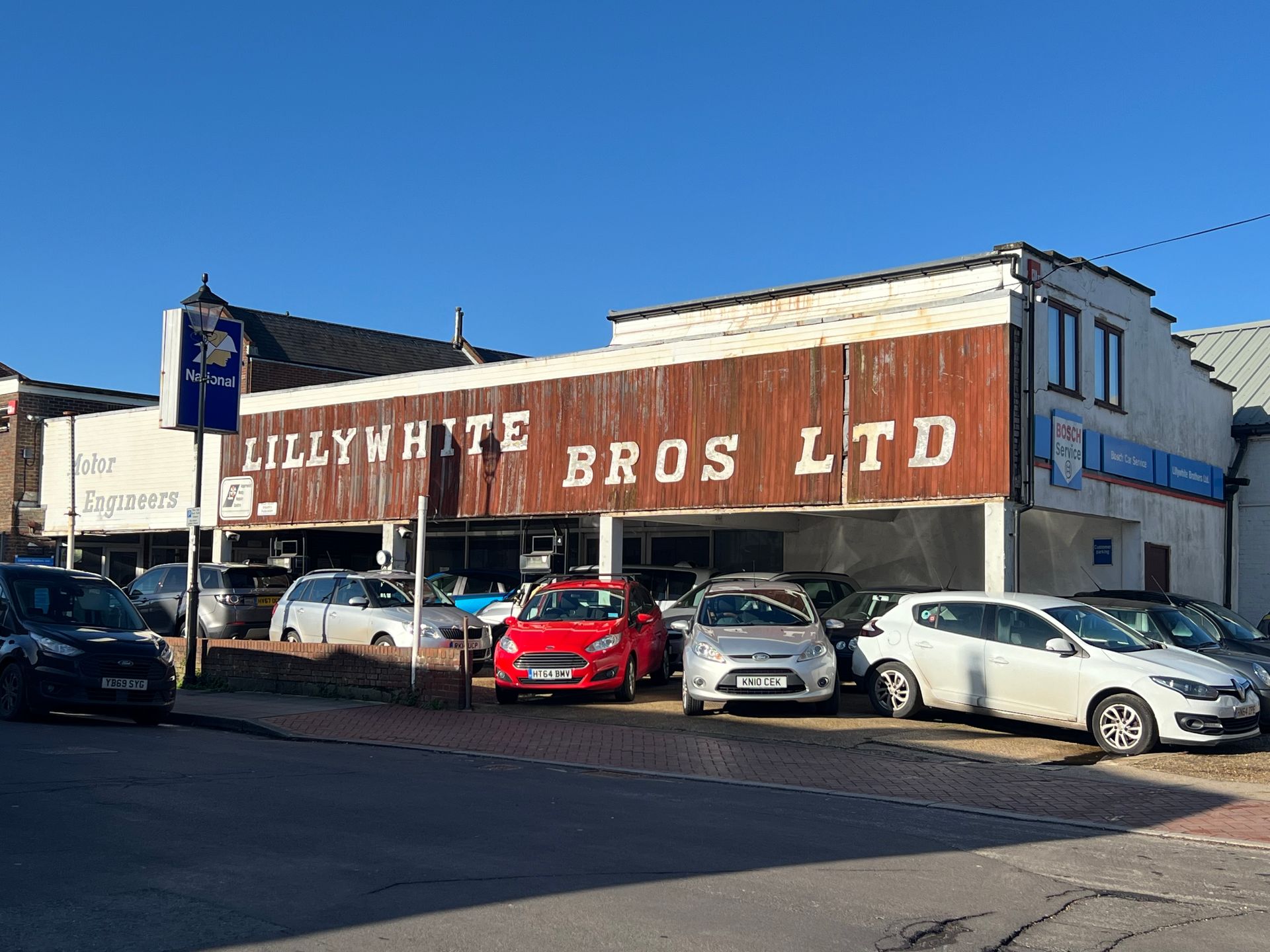
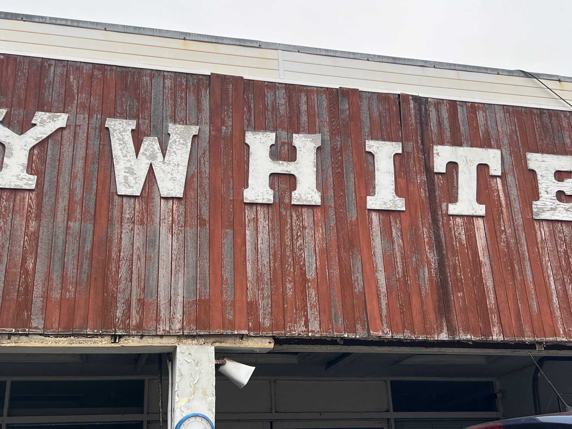
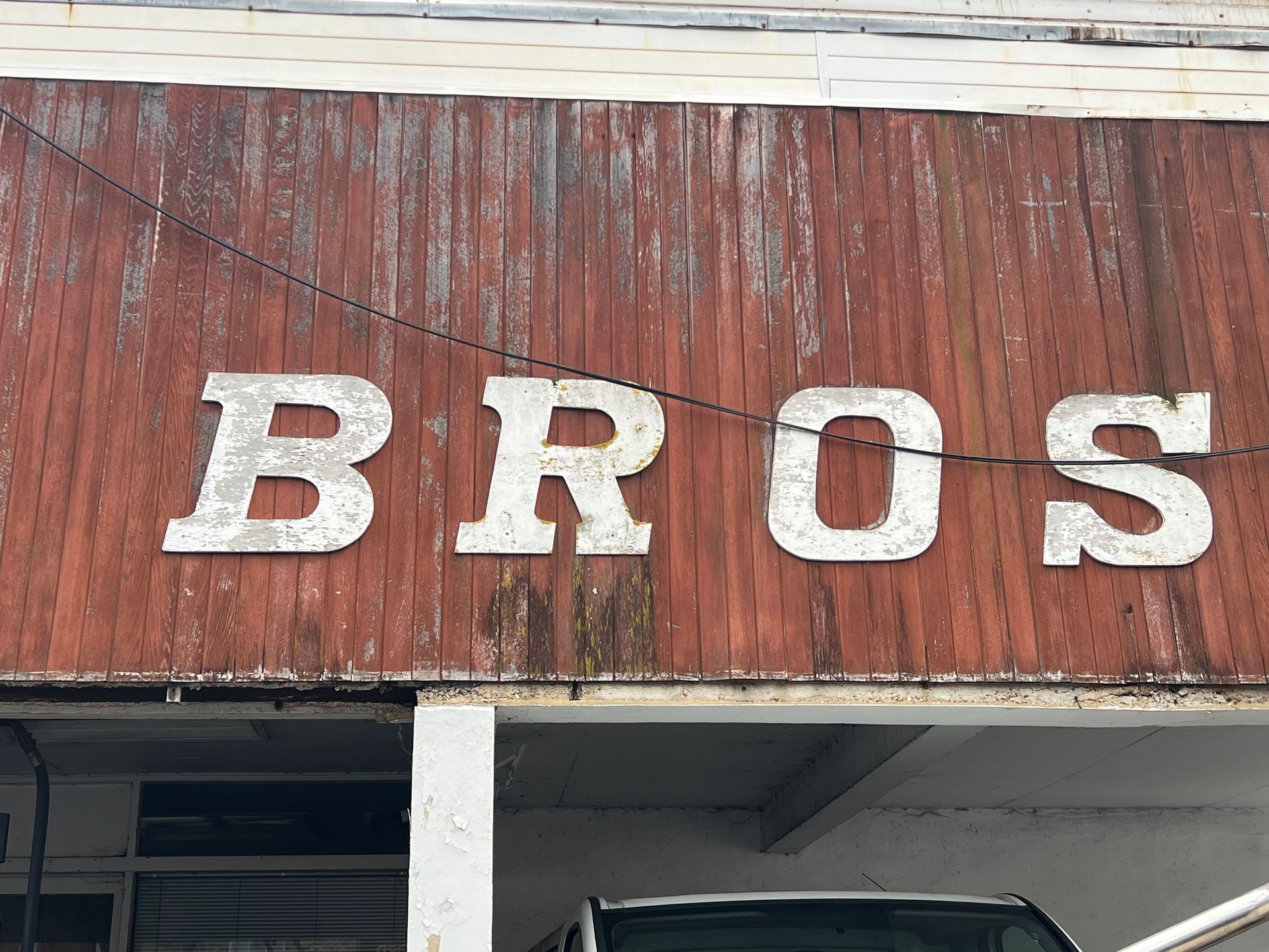
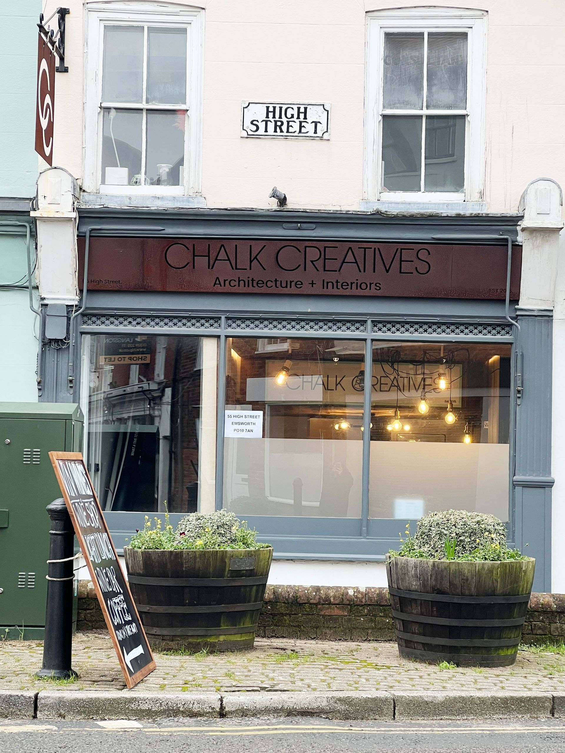
The heavy weight of the sans serif typeface works beautifully to echo the buildings windows and vertical timber within the roof apexs'. Sympathetic to the building. I then found this old photograph from 1920s, which has a similar style of sans serif lettering on the light coloured exterior, long before the illustrated hanging pub sign with serif typeface. Proof that trends come full circle. To think when sans serif typefaces first came to be used in the Victorian era they were considered ugly and it is thought that was where the name grotesque came from, as in horrible. The word Grotesque, or Grotesk in German, is often used as a synonym for sans-serif in typography.
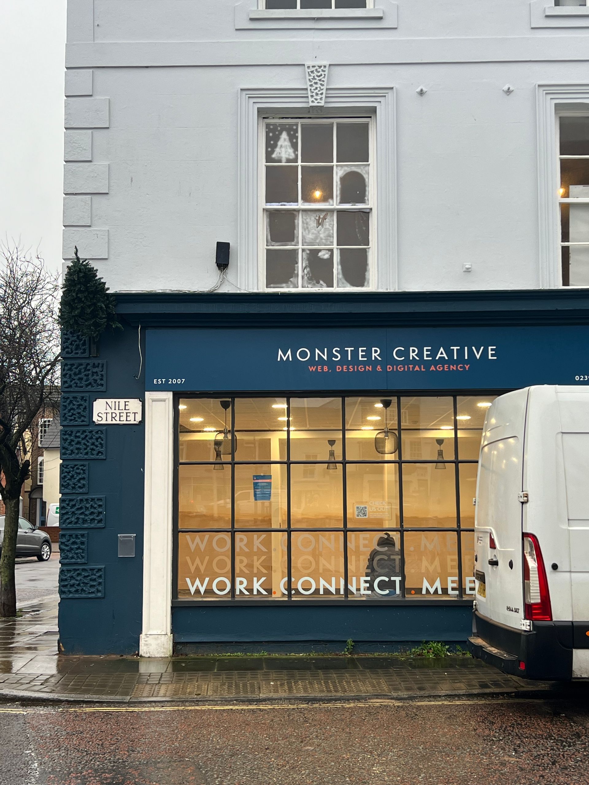
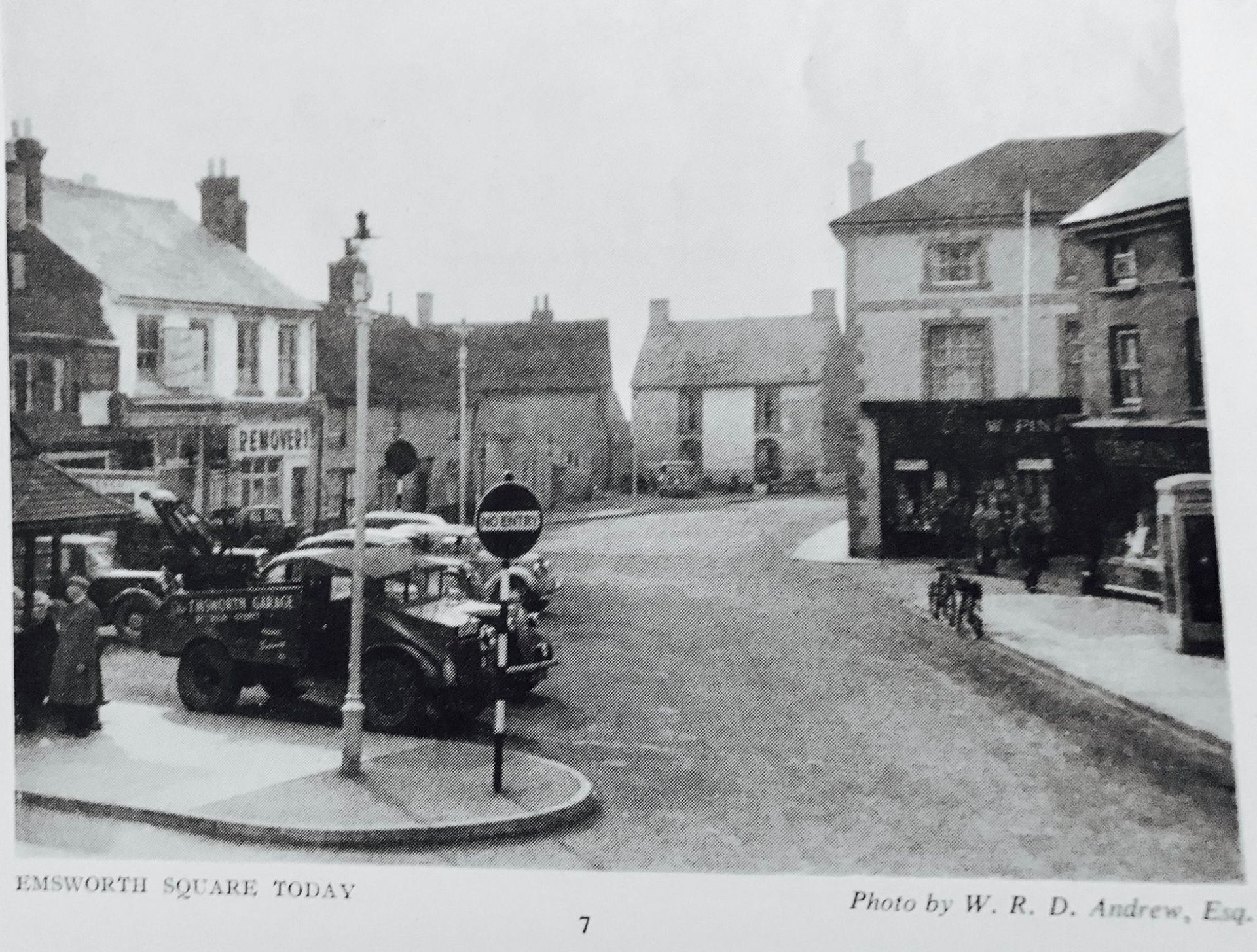
Similarly to Chalk, the Monster Creative & Emsworth Co-working signage harmoniously sits with the building and the typeface's lighter weight compliments the narrow muntins dividing the panes of glass in the windows. Again, looking into the archives I found an old photo of Emsworth Square and you can see the shop front of Pinks Butchers was also painted in a dark colour with the shop's name in white. Although, but extending the colour to the full width of the building gives it a more modern feel and creates a clear division from the upper part of building.


Photos: Ellie Cross | B&W images: Memories of Old Emsworth (2020)
Boat Names & House Plaques/Numbers
New Paragraph
Photos:
References
Dalgleish, Liz (2020), Memories of Old Emsworth [Facebook] 21 October. Available at https://www.facebook.com/groups/1010415952338059/search/?q=corbins&locale=en_GB. [Accessed 25th January 2024].
Emsworth Online (nd), Emsworth's History - The History of Emsworth's Public Houses. Available at https://www.emsworthonline.co.uk/The%20History%20of%20Emsworth%27s%20Pubs.html. [Accessed 26th January 2024].
Google maps (nd), Chalk Creatives. Available at https://www.google.com/local/place/fid/0x48744f44c03bf02d:0x113d031046ae6713/photosphere?iu=https://streetviewpixels-pa.googleapis.com/v1/thumbnail?panoid%3D_yFmxV0p0eGzyEsvRn_wkA%26cb_client%3Dlu.gallery.gps%26w%3D160%26h%3D106%26yaw%3D208.21268%26pitch%3D0%26thumbfov%3D100&ik=CAISFl95Rm14VjBwMGVHenlFc3ZSbl93a0E%3D. [Accessed 24th January 2024].
Hisour (nd), Anchor plate. Available at https://www.hisour.com/anchor-plate-28463/. [Accessed 24th January 2024].
Wikipedia (2022), Anchor plate. Available at https://en.wikipedia.org/wiki/Anchor_plate. [Accessed 25th January 2024].
Wright, Daniel (3 November 2021), How Serifs lost the road war but won the streets. Available at https://thebeautyoftransport.com/2021/11/03/how-serifs-lost-the-road-war-but-won-the-streets/. [Accessed 23rd January 2024]