Constructs of Typography, Systems and Theory
Challenge Task
How can typographic conventions and design inform and imbue the meaning of a given text?
This weeks challenge was to take an excerpt from a national poet or writer and transform the text into a single typographic composition:
- Redesign the first line of text in a style that’s appropriate to the subject - draw it, render it, build it;
- Then take the body of the text and typeset it.
- Be experimental. How does leading, positioning, stresses on particular words and detailing affect the power of the piece?
- How is meaning affected by interpretation in a tangible way?
- What is the relationship of the page?
Poem and Inspiration
I chose the poem as it is playful and reminiscent of many a time spent feeding the ducks with my daughter and from my own childhood. The poem is a ‘ditty’ from the Wind in the Willows sung by Ratty. Moley didn’t care for it much to whom Ratty replied:
“Nor don’t the ducks neither,” replied the Rat cheerfully. “They say, ‘Why can’t fellows be allowed to do what they like when they like and as they like, instead of other fellows sitting on banks and watching them all the time and making remarks and poetry and things about them? What nonsense it all is!’ That’s what the ducks say.”
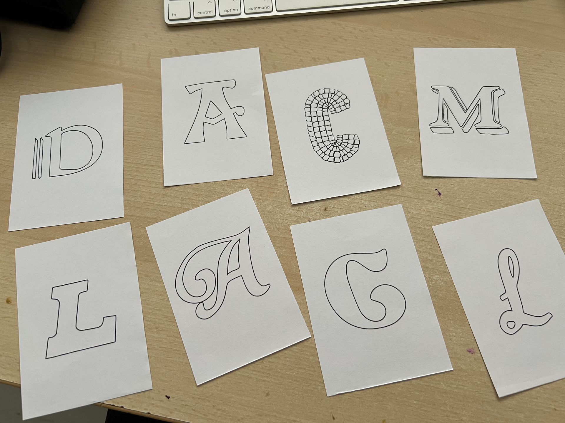
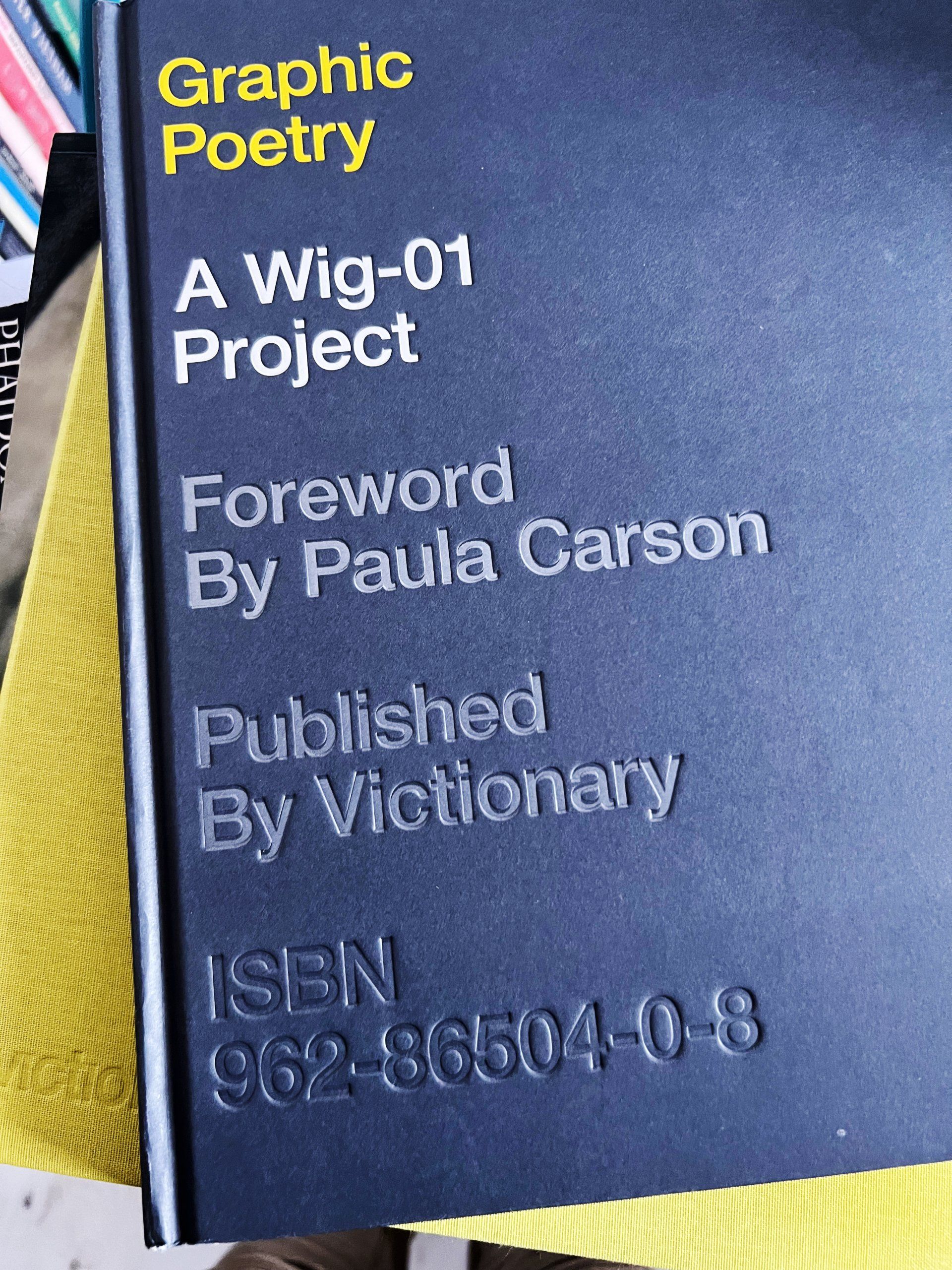
After our lecture this week on typography and a brief history, I wanted to explore analogue methods for the type and not automatically go to the computer. For inspiration I looked at one of my books, 'Graphic Poetry' (Wig-01, 2005) a collaborative project between graphic designers and poets.
“In comparison to text, a picture is something we respond to more quickly and easily. If the image intrigues, it should encourage one to read the poem, even if it is only to decipher the image.”
Marion Deuchars (Wig-01, 2005, p.10)
Being reminded of Alan Kitching's work I love how he uses scale and colour often alone within his letterpress compositions to express meaning. In the example below the print almost feels alive, as the scale and structure appears to bring the type alive to gesture a kiss; thus the content of the poem (Wig-01, 2005, pp.68-69).
Concrete poetry like 'Il pleut' use type as illustration with letters cascading across the page to imbue its meaning. Sam Winston's, 'A Dictionary's Story' employs a similar technique with a sandstorm of type floating, falling, flying across the page reflecting the meaning of the words and bringing the story to life in such a beautiful way.
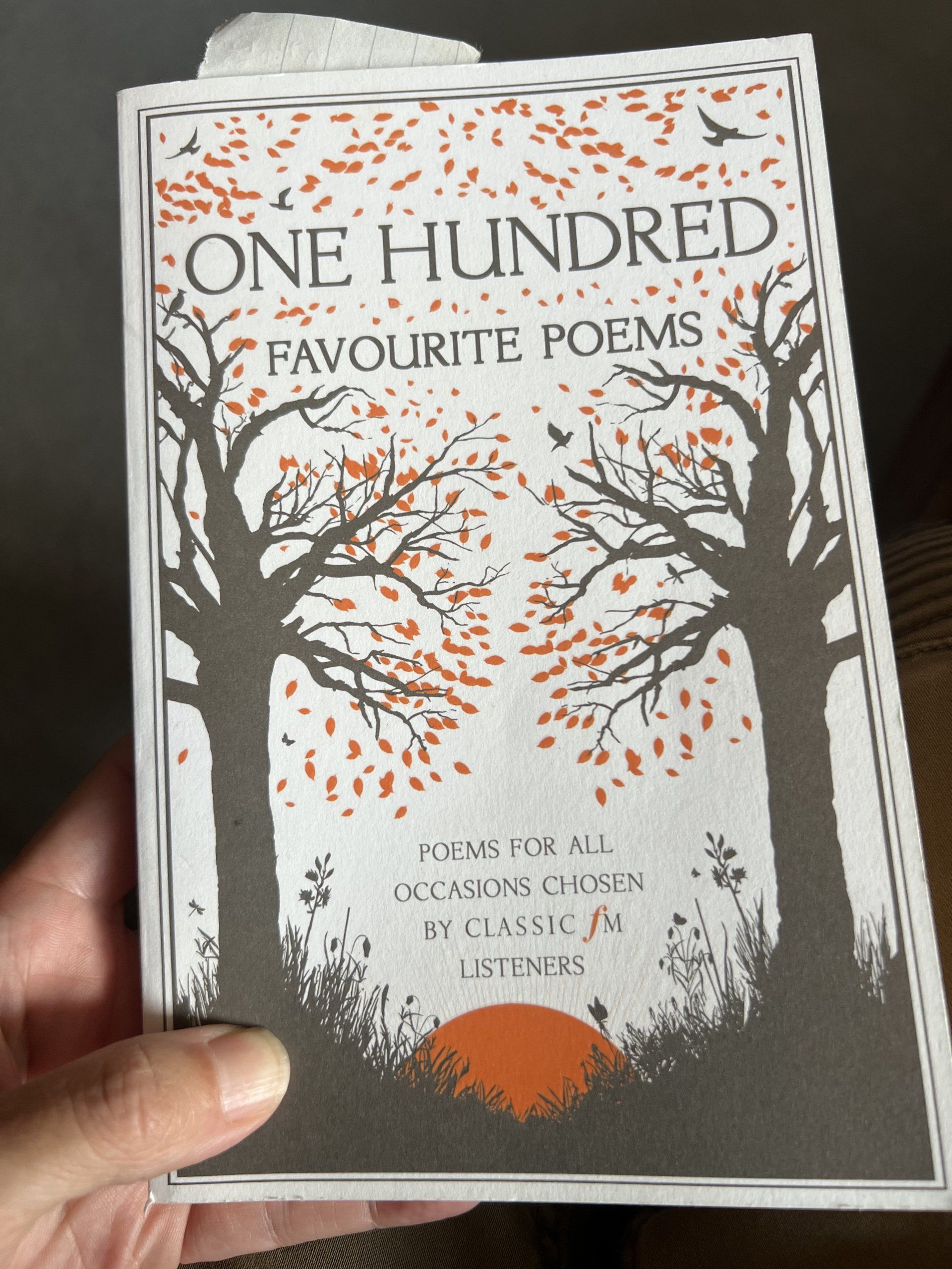
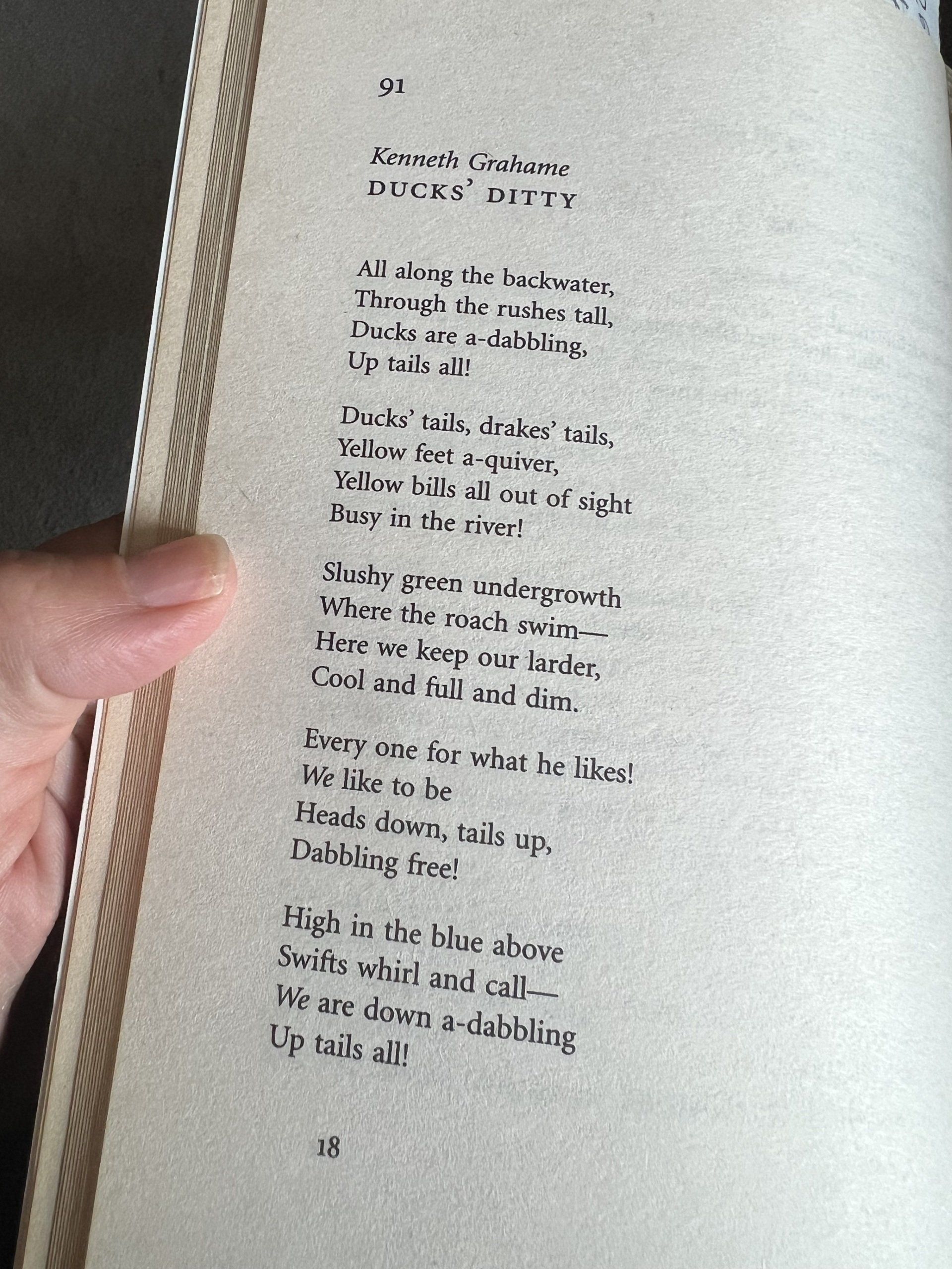
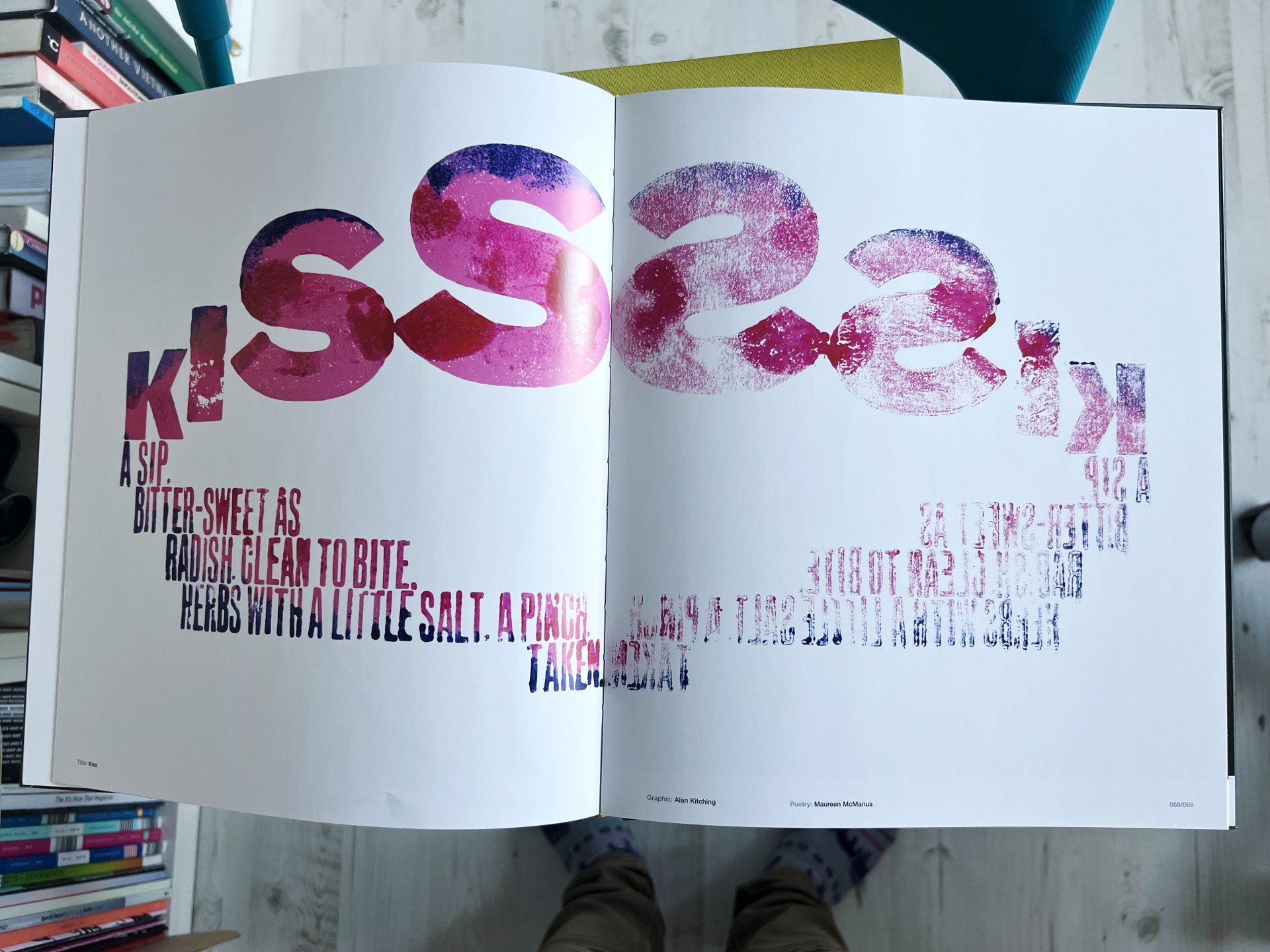
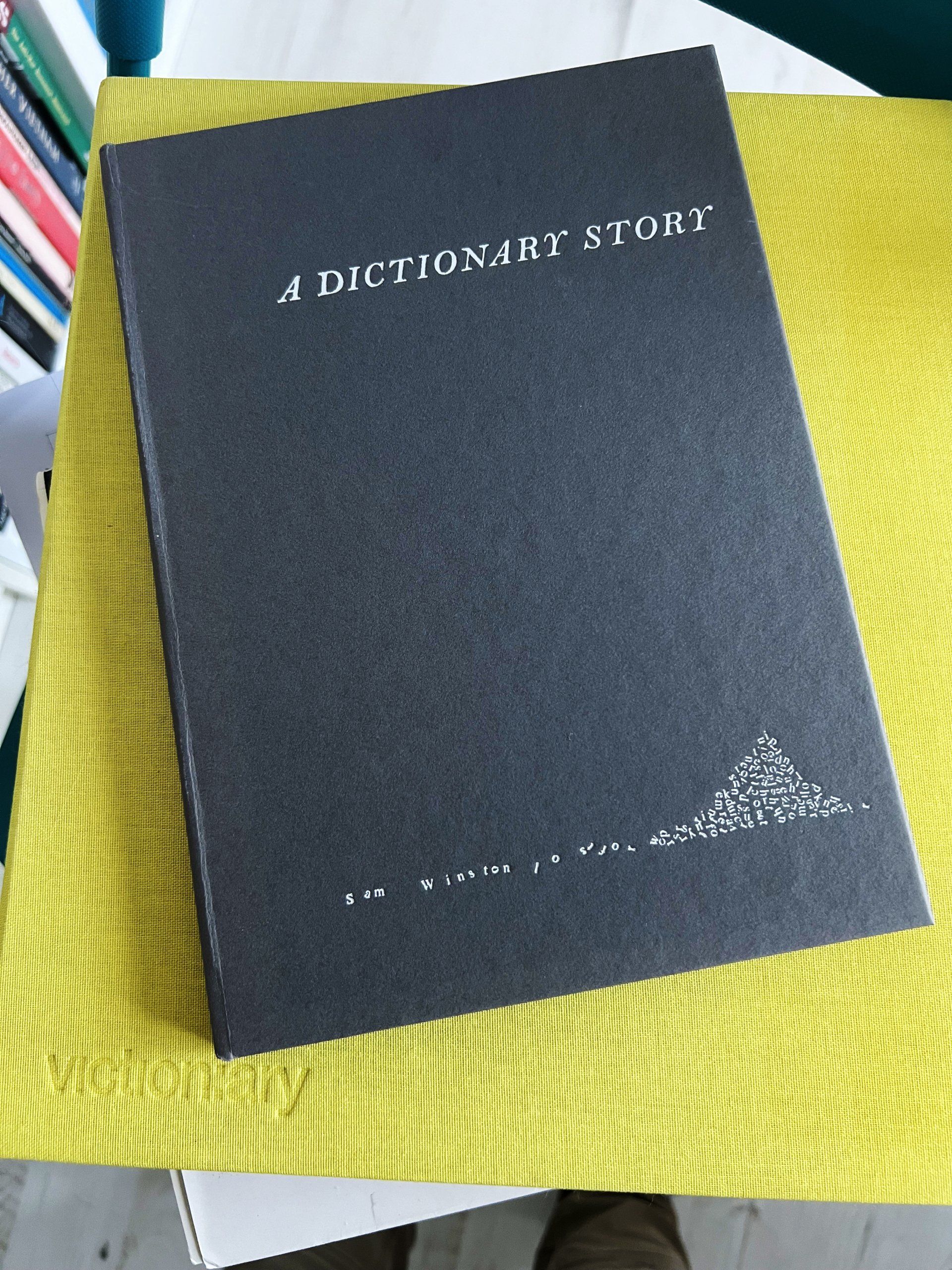
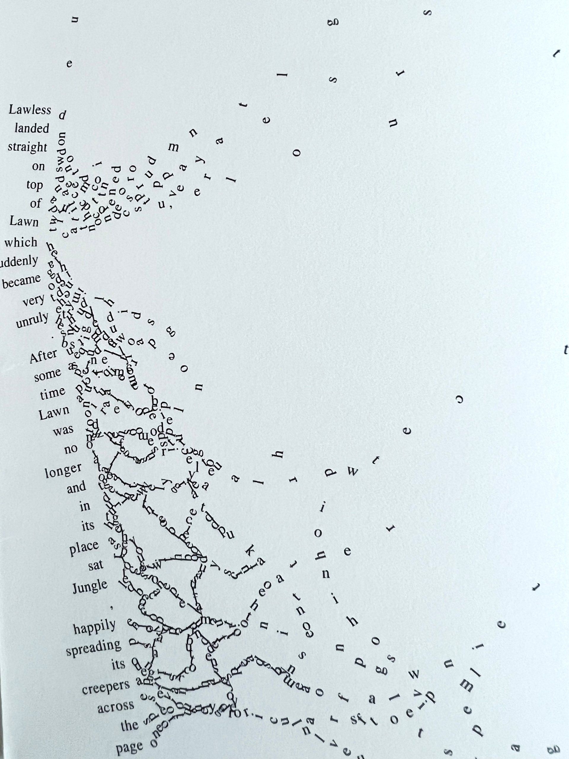
Images: Poem's origin 1 and 2 (Classic FM, 2010, p.18). Inspiration sort from the book, Graphic Poetry with example of Alan Kitching's Kiss composition 3 and 4 (Wig-01, 2005, pp.68-69). Lastly, Sam Winston's book, A Dictionary Story, with exert from the book 5 and 6 (Winston, 2009).
Experimentation
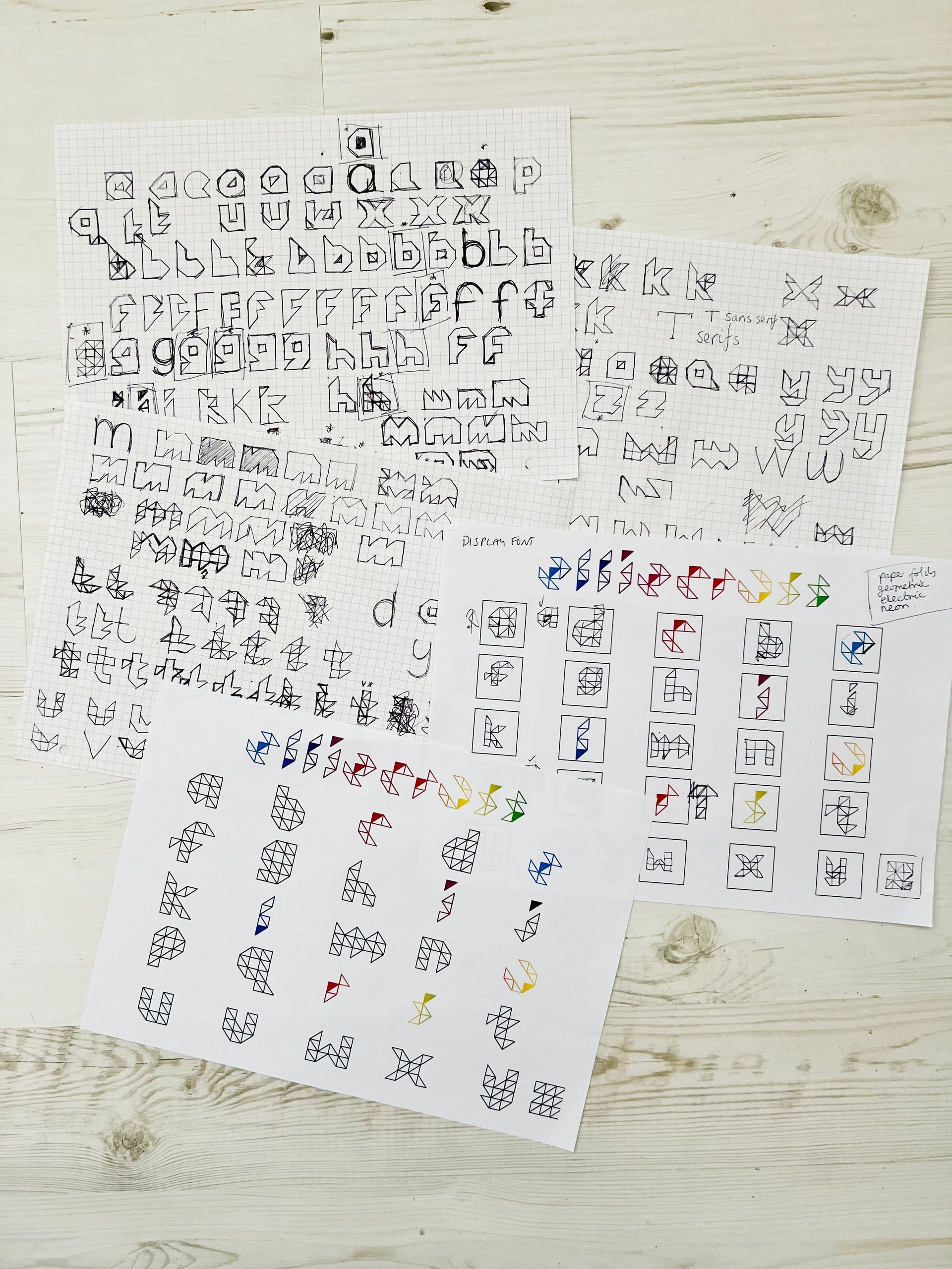
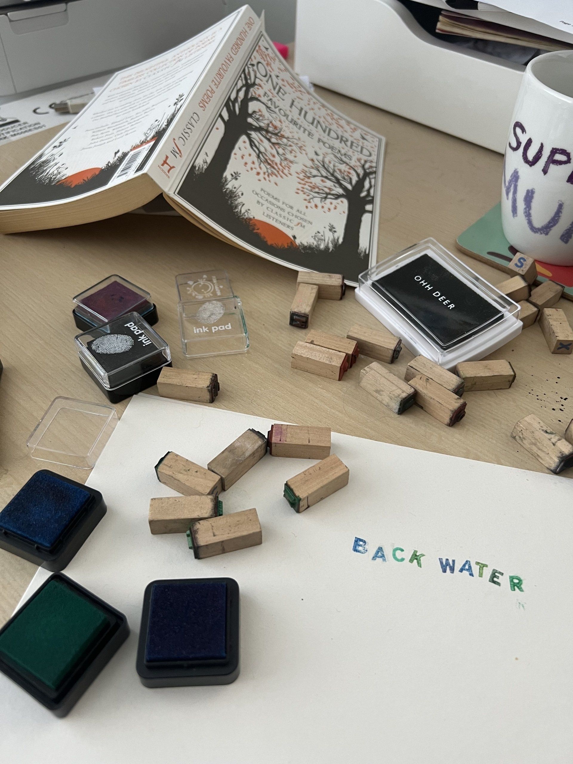
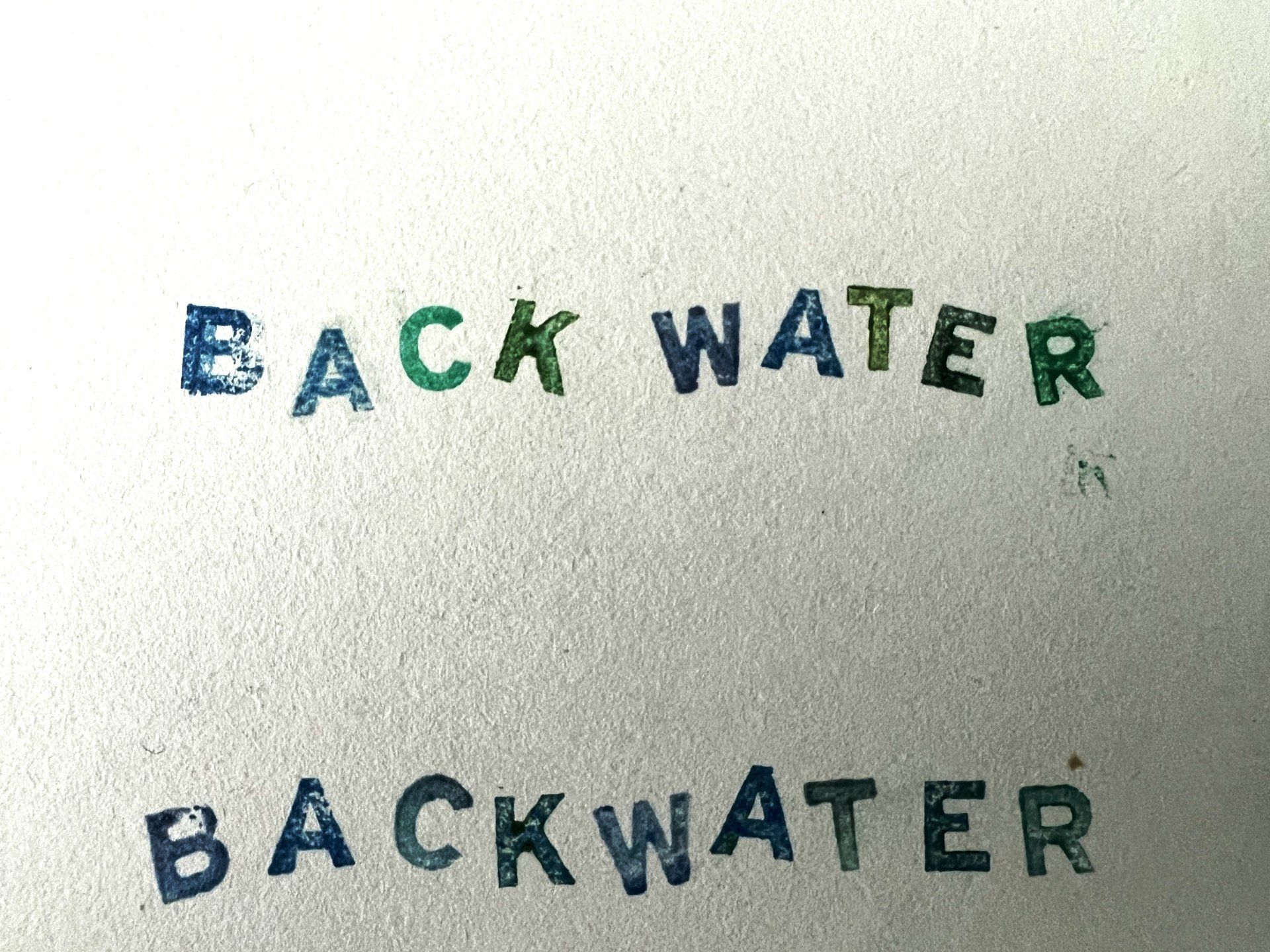
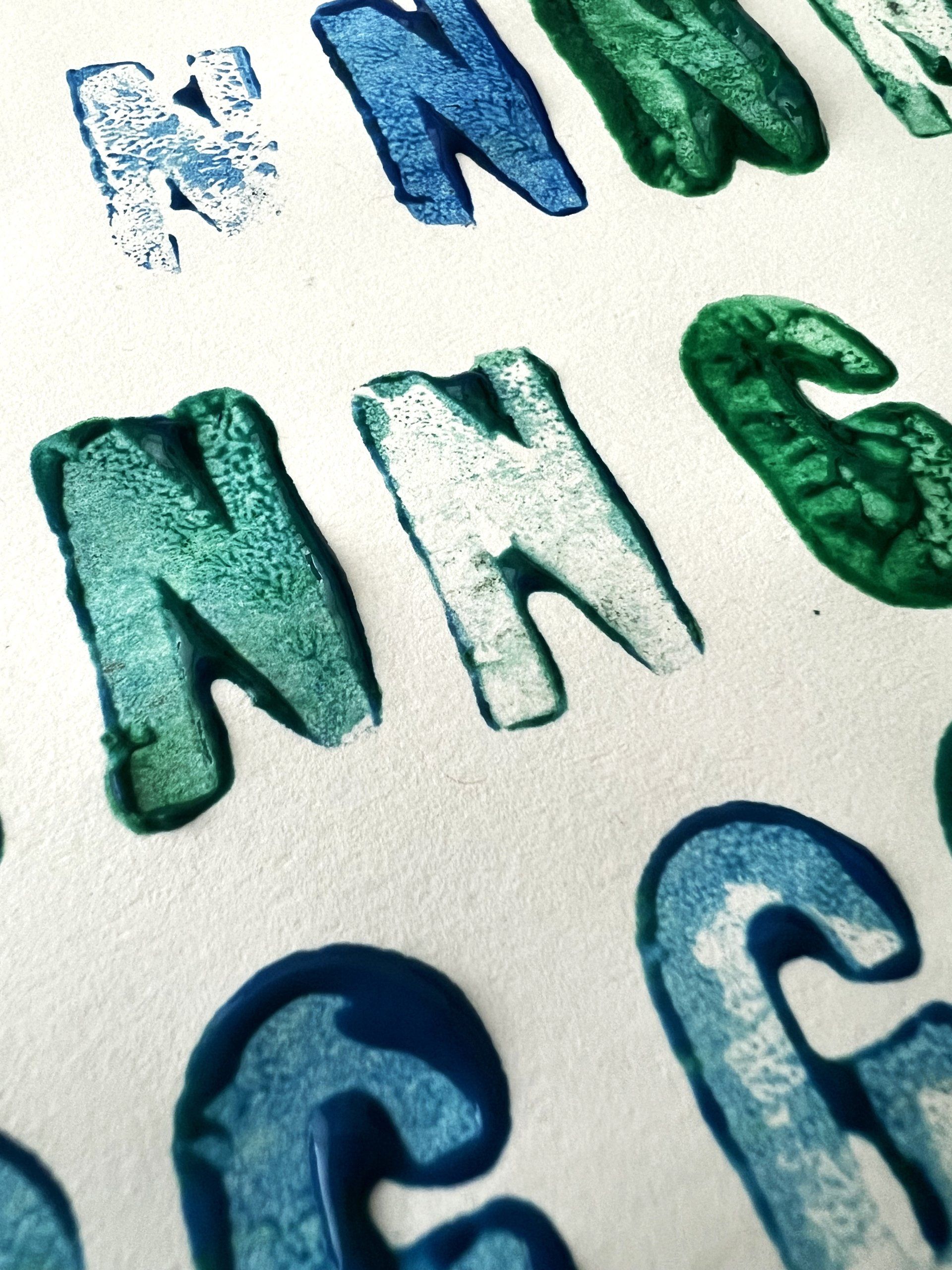
I began with experimenting with letter stamps and ink pads. I looked at how the arrangement of the letters can start to illustrate the words i.e. backwater below becomes more fluid and begins to move just like a river. However, this would not help add meaning to the poem, backwater being the stagnant part of the river! I continued to play adding more space (kerning) between some of the letters, overprinting and using different colours of ink.
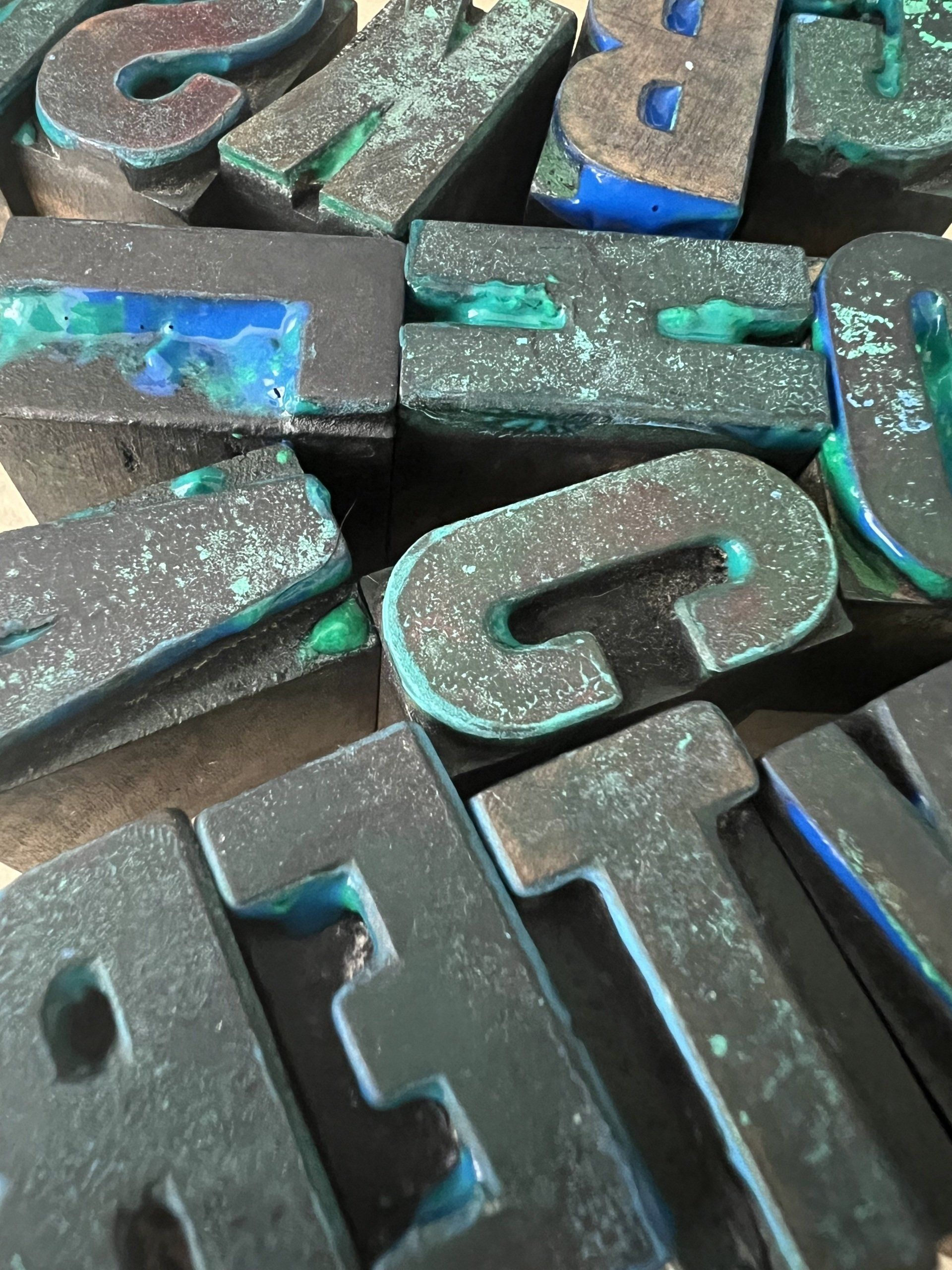
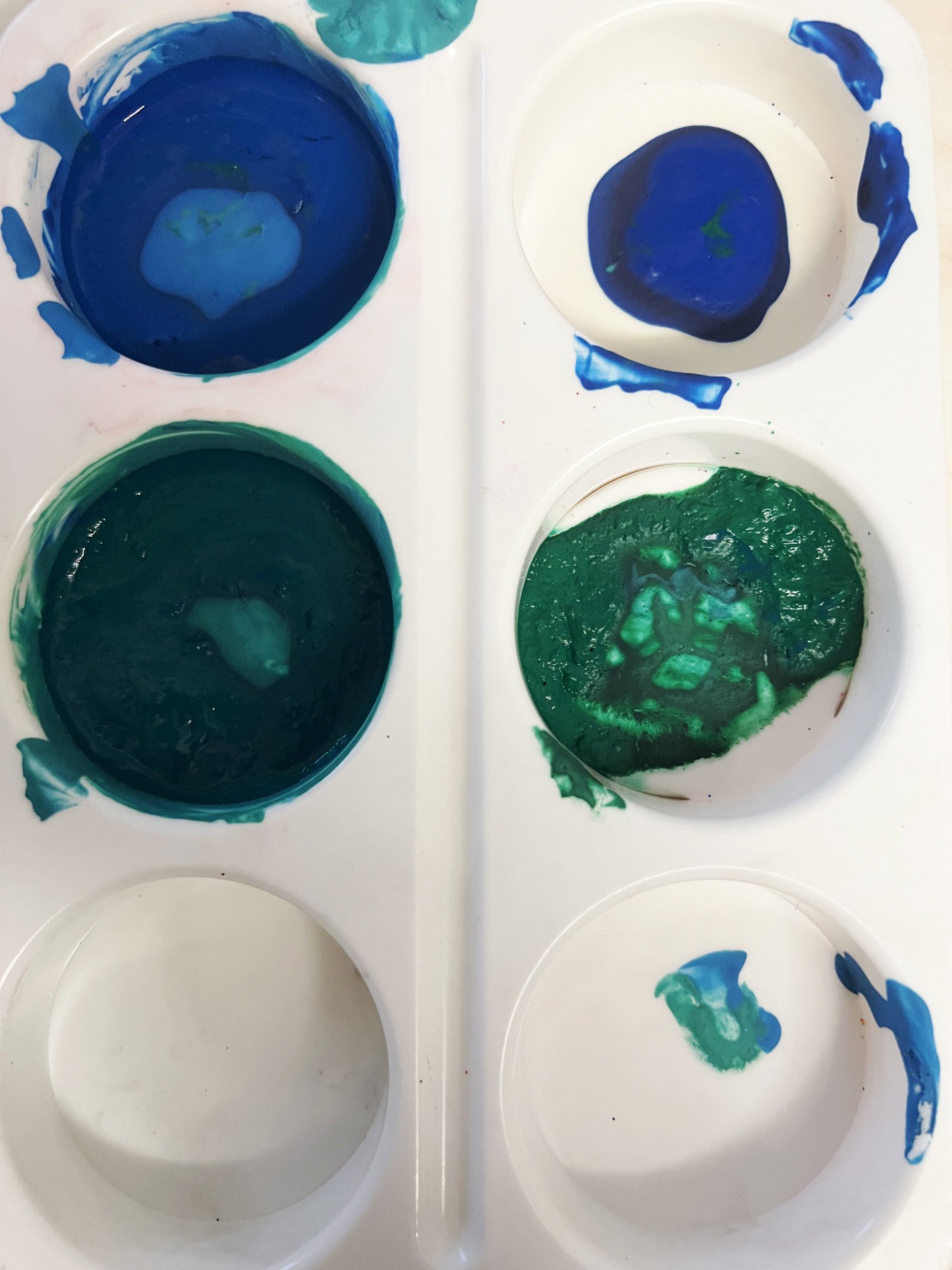
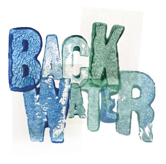
Next I printed each of the wooden type blocks I would need to spell 'backwater'. I chose to use this exercise to explore colour, mixing greens and blues to mimic that of stagnant, sludgy, algae ridden water. I only have one set of wooden type, so I thought I could scan the prints and experiment with scale and composition onscreen later on.
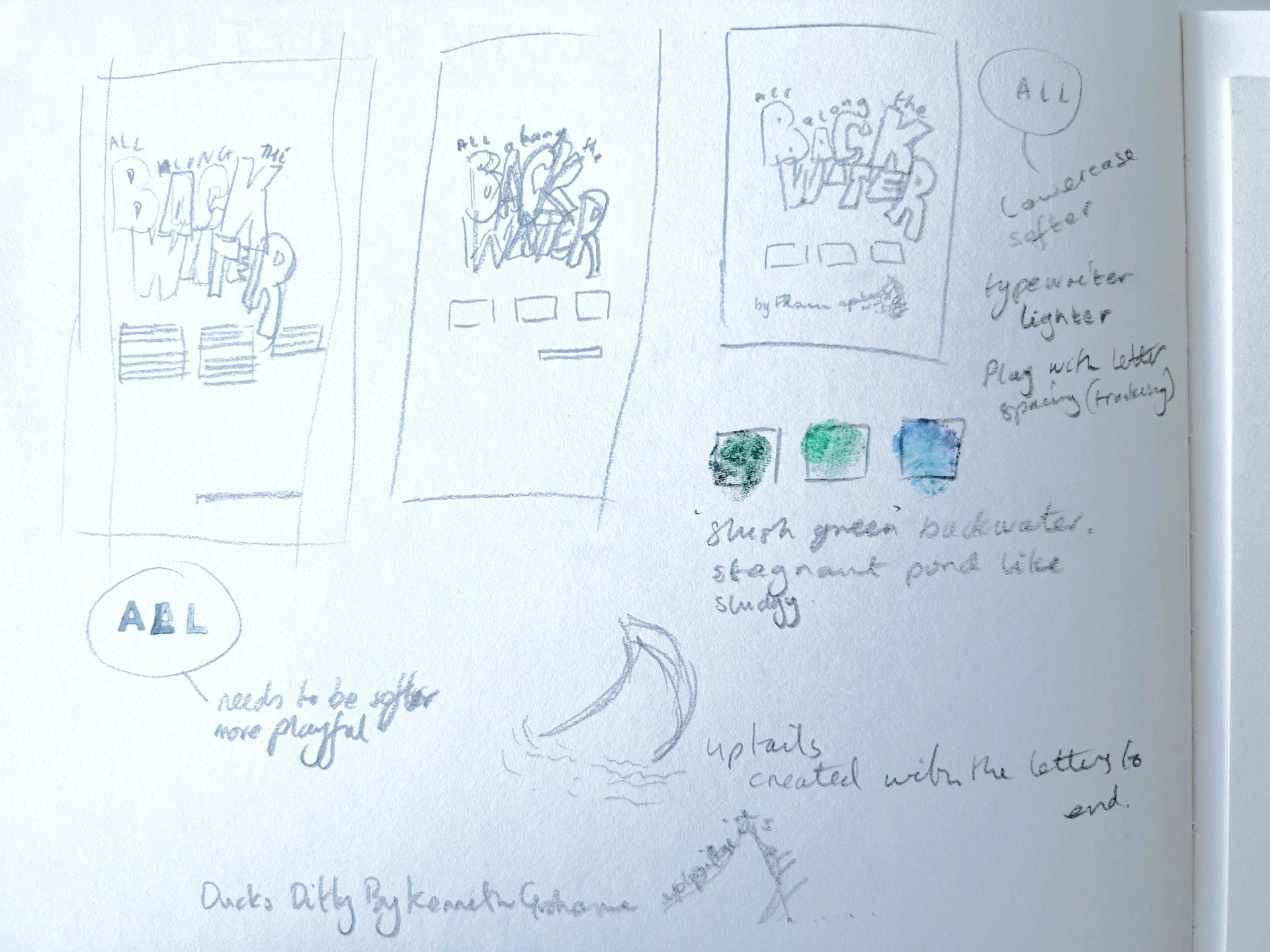
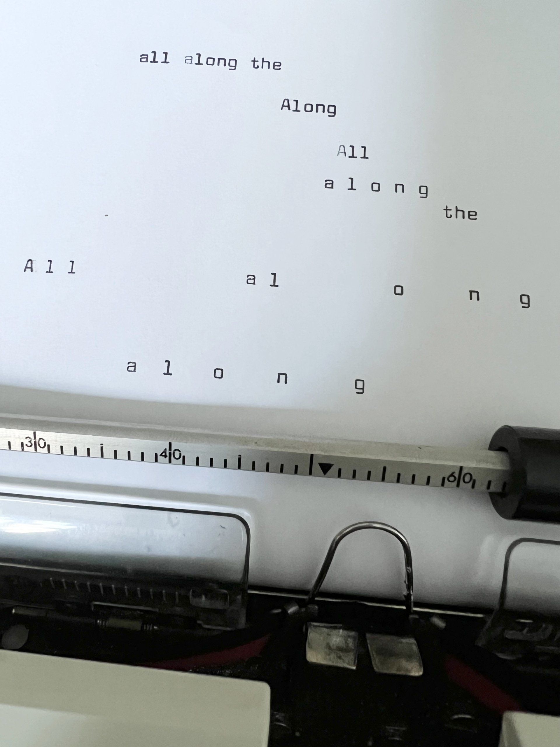
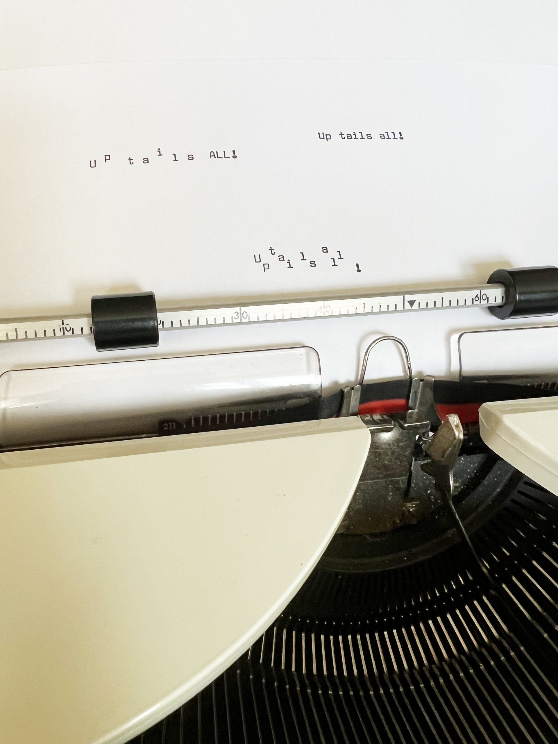
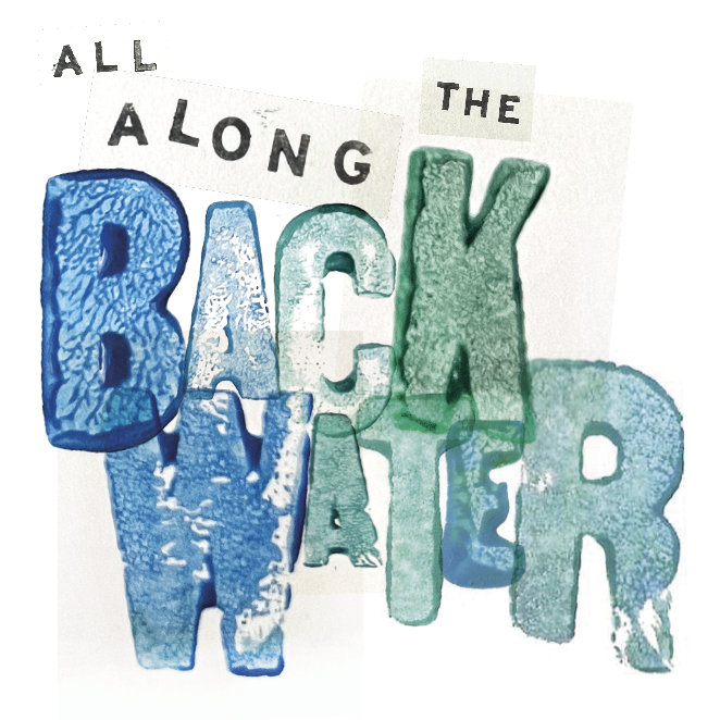
With a few type experiments complete I did a few sketches for possible layout ideas and other techniques to try before remembering my typewriter! I used the typewriter to play with the words 'All along the' by increasing the kerning between the letters, as well as dropping letters between lines, altering their baseline and again add some movement. At this point I made the decision to put emphasis only on the words 'along' and 'backwater'.
Development
After scanning the wood block prints, I chose a selection of block letters to spell, 'backwater' and then began to play with the type size in Adobe Illustrator. Each letter was then placed onto the artboard and a multiply transparency applied to merge the layers. This added fluidity to the type seeping into each other. The word was rather long, so I felt it better to break it up, that way it would also play on the meaning with the placement of 'back' on the back of the 'water'! The imperfections of the Rs shortened stem gave it more of a fluid impression to the Rs tail, as if pouring out of its tail and subsequently the word composition. I chose to use Illustrator, as it gives you so much more control over the type when it comes to typesetting the main body.
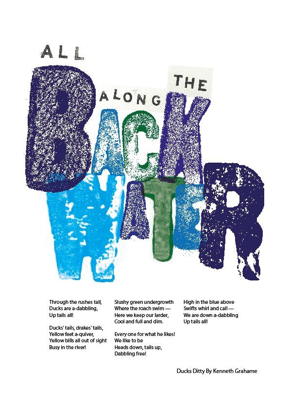

I used the same type treatment for the stamped letters, scanning them in, but this time as whole words rather than individual letters (image 2). Each word was then placed onto the artboard and a multiply transparency applied to merge the layers. I then experimented with the type sizes and word placement.
I haven't used bitmaps for years and wondered if it might make playing with colour a little easier and quicker, as you can select the colour for each bitmap image using the fill or swatches. I created a set of bitmapped images of the letters using Adobe Photoshop, saving them as tiffs before placing them into Illustrator (image 3). However, the letters lost a lot of their natural texture, which I felt was reminiscent of water ripples that added to the piece.
Looking at the stamped letters I began to feel they seemed a little stark and needed to be a bit less heavy. Going back to my typewritten words created on the typewriter, I felt they were lighter and more playful, reminiscent of Sam Winston's work and fitted more with the poem. Using the same type treatment as before I scanned the words and placed them into the Illustrator composition. The word 'along' now playfully bounces 'a l o n g ' the top of the 'a' and 'c'.
With this decision I began to look for a similar typewriter font for the body, settling for, Nitti Typewriter. I increased the leading between stanzas, so they could be easily distinguishable. Finally, I wanted to finish with a more whimsical treatment, similar to how the poem began. Here, I began to play with drawing duck tails to reiterate the idea of the ducks dabbling and exploring how to add the idea of water ripples to demonstrate being in water (image 4). The duck tail was drawn using the pen tool and ripples using the ellipse tool, before adding type on a path. Initially, I was only going to use the last two lines of the final verse here, but the other two became detached and were left out on a limb. So, I added a whirl for the swifts! Here I used the paintbrush tool to get a smoother line for the type path. I increased the tracking to replicate the letterspacing of the typewriter at the beginning of the poem. Opening up the tracking also gave the type breathing space making it easier to read on the path (Ambrose and Harris, 2005, pp.94-95).
Final Outcome
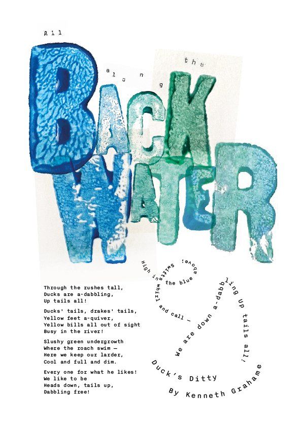
I have really enjoyed this challenge, especially exploring type by hand. The type setting on the swift's whirl needs some adjusting to relieve the slight clash or near miss of words, yet I think they are still readable. I added the poem's name and author to finish the composition with concentric circles. Had I produced this all digitally it wouldn't have had the same expression I believe adds to the words and brings them visually to life.
By using type on a path for the last stanza it balances the composition with the typewritten opening words.
References
Ambrose, G. and Harris, P. (2005) Basics Design 3: Typography. Switzerland: AVA Publishing SA.
Classic FM (2010) One Hundred Favourite Poems: Poems for all Occassions Chosen by Classic FM Listeners. London: Hodder & Stoughton.
Wig-01 (2005) Graphic Poetry: A Wig-01 Project. Hong Kong: Viction Workshop; Slp edition.
Winston, S. (2009) A Dictionary Story. London: Arc Artists Editions.