Lighting up the Message, Symbolism and Semiotics of the New
Challenge Task
Case Study: Take a brand and look at how it is delivered in different countries, e.g. alcohol, tobacco, transport, cars. Is it symbolised in a different way? Why might colour or typeface have been changed? Does it work at a local level and does it work at a global level?
This case study explores how society is subtly manipulated by a message and how graphic design is deployed in a global context.
One of the Wests best loved brand, Heinz has been around for more than 150 years and is enjoyed the world over in one form or another.
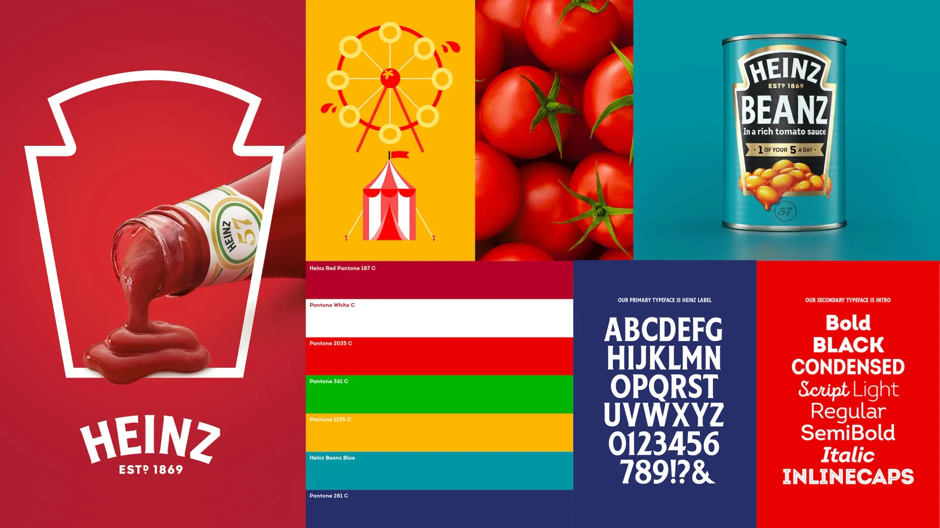
In 2020, Jones Knowles Ritchie worked on creating a ‘Masterbrand’ to unify Heinz’s identity internationally. The brands iconic keystone shape has been simplified to act as a frame to put emphasis on its food photography across all its 20 product categories (Brewer, 2020).
Like the Olympic games iconic rings, the keystone is a learned symbol that is instantly recognisable across the globe, along with the Heinz logotype. The keystone originates from the company’s beginnings in Pennsylvania, USA, where the state looks a similar shape when viewed on a map.
The colours have been refined to a select set of striking pantones. The original red used for their tomato ketchup has been kept and represents the ingredients, fresh and healthy.
Being a global brand, they are always looking for new markets and avenues to go with their business, so they often come up with new products suited to the local culture or market. China for instance has its own Master soy sauce, but it has deviated from the Masterbrand to appeal to a local audience.
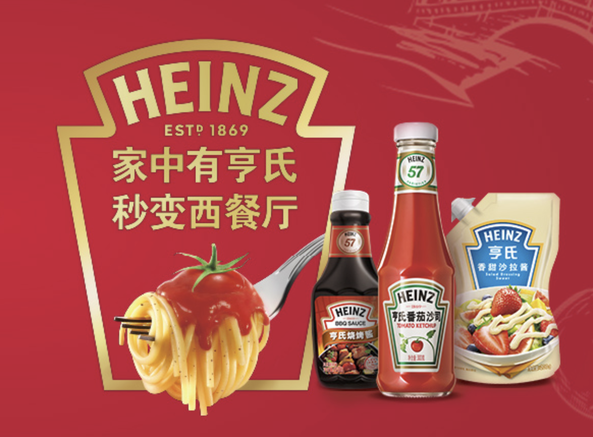
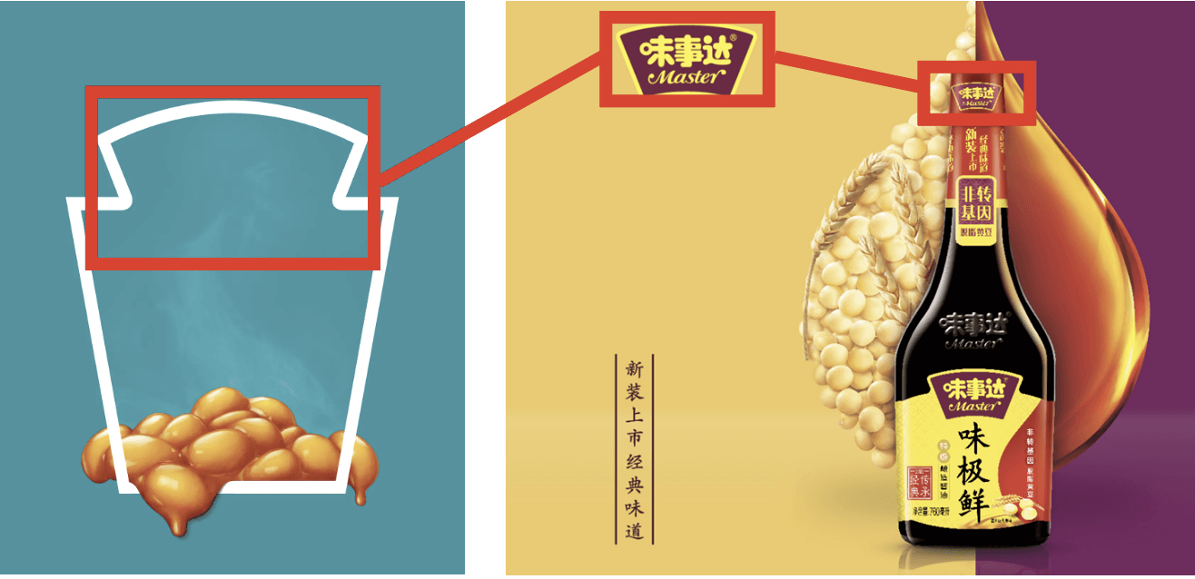
Examining the packaging for the Master soy sauce, note that the keystone is reduced to just the top arch, as I have indicated in the adjacent images. Subsequently, along with the label written in Chinese you wouldn’t know it was a Heinz product. However, the advert is on brand with its use of images depicting fresh and healthy ingredients, along with the adverts striking colours. Look again and you notice more gold has been used on the advertising and packaging in the Heinz range, which like in western society symbolises wealth and riches in Chinese culture too. So, the idea could be to make the Heinz products look more prestigious amongst other brands.
The Heinz logotype remains the same on all of its condiments but its product name i.e., tomato ketchup there has been a typographic decision to use Chinese glyphs or characters to keep in line with the local culture.
The colours used on the Chinese sauce, red and yellow, will have been a considered decision to add meaning. Yellow is an imperial colour in the traditional Chinese colour system, and it represents power, royalty and prosperity. Yellow can also be associated with pornography publications in China, so it should be used with caution in brand marketing to avoid making a disastrous marketing faux pas. The red is a popular and promising colour in Chinese culture that symbolises luck, happiness, and joy. Purple in modern times is used to represent love and is attractive to younger consumers (Olsen, 2022). With these things in mind, looking at semiotics and meaning especially within a non-native culture you can understand why large brands appoint expertise specific to the target market. Kraft Heinz appointed BBH China for their creative lead in China, as they are said to have brand-building expertise with a deep knowledge of the Chinese market (campaign, 2020). Decisions on global brands and how they are packaged can quite simply make or break them in their targeted market.
Reference List
Brewer, J. (2020) Heinz gets first ever global masterbrand, served up by JKR. Available at https://www.itsnicethat.com/news/jones-knowles-ritchie-jkr-heinz-masterbrand-graphic-design-100620 (Accessed 7th December 2022).
Campaign (2020) Kraft Heinz picks BBH in China. Available at https://www.campaignasia.com/article/kraft-heinz-picks-bbh-in-china/463496 (Accessed 8 December 2022).
Jones Knowles Richie (2022) Available at https://jkrglobal.com/case-studies/heinz-2/ (Accessed 8 December 2022).
Image source:
Brewer, J. (2020) Heinz gets first ever global masterbrand, served up by JKR. Available at https://www.itsnicethat.com/news/jones-knowles-ritchie-jkr-heinz-masterbrand-graphic-design-100620 (Accessed 7th December 2022).
Kraft Heinz China (2022). Available at https://www.kraftheinzchina.com/Accessed 8 December 2022).

